Summary: US equities have dropped some 10% in the past two weeks, returning to their August/September lows. This has triggered a bearish technical pattern. Is the stock market signaling a recession and the start of a bear market? Risk has clearly increased, but on balance, the evidence suggests the answer remains no.
It was another week of steep selling: SPDR S&P 500 (N:SPY) lost 2%, the NASDAQ 100 lost 3% and the Russell 2000 lost nearly 4%. Small caps are still leading to the downside, with large caps holding up the best.
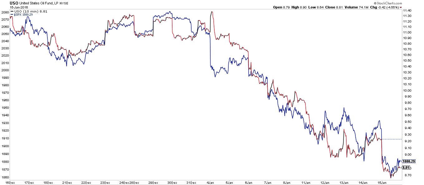
The biggest loser continues to be oil. After losing 11% last week it fell another 10% this past week. This is not a sideshow. Oil and equities are usually, but not always, correlated. Between 1985 and 2000, the relationship was muddled and inconsistent; since 2000, however, oil and equities have moved mostly in the same direction (more on this here).
For the time being, the correlation between oil (red line) and equities (blue line) is unusually tight. It's a fair guess that equities will have a hard time rising until oil stabilizes or an event occurs that supersedes this relationship.
The sell-off over the past 2 weeks has pushed the major indices right back to their August/September lows. It's cold comfort that this was prior support, as prior support levels have been shredded on the way down.
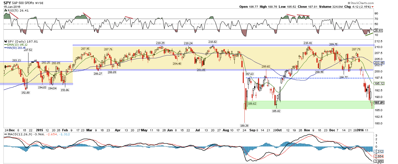
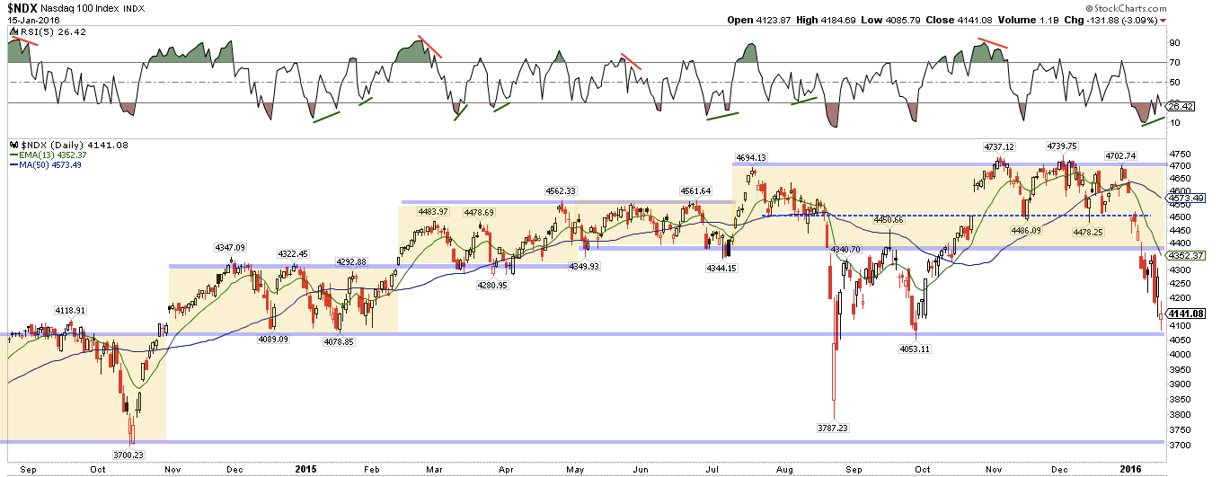
There is no bottoming pattern in either of the charts above: indices are pushing to new lows and losses on Friday were 2% and 3%, respectively. Big buyers have not notably taken a bite at these levels.
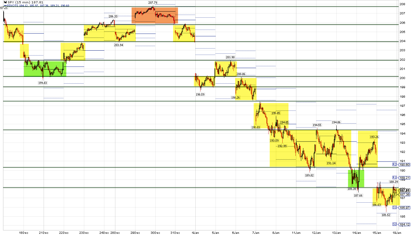
Equities have been stair stepping lower. The bounce on Thursday looked promising: a big rise (+2%) on good volume. But it failed miserably on Friday. What we are looking for now is for the stairs to overlap higher up (green shading). That will be the first signal that the downtrend may be changing direction.
"Oversold" conditions are abundant. Most of the time, that means the trend has exhausted itself and is set to reverse. But nothing works perfectly and this is one of those times where "oversold" has yet to mean anything.
Why? Market indicators summarize the actions of millions of investors; by definition, this can be unpredictable. At times the negative (or positive) psychology of the market is overwhelming.
On Friday, for example, the equity-only put/call ratio reached 1.14x; among the few times this has happened in the past was September 15, 2008, the day Lehman Brothers went bust. These are panic conditions that swamp "oversold" readings and price support levels.
It's not just put/call ratios that are at extremes. A full listing would be redundant; here are four examples:
- The percentage of AAII investors that are bullish is just 18%; it has only been lower once in the past 20 years (the April 2005 low in SPY).
- An average of more than $6B has flowed out of equity funds in the past 5 weeks; since 2003, the only times outflows have been greater were in 2008 and at the market lows in March 2009 and late August 2011.
- Only 20% of S&P companies are above their 200-ema; in the past 16 years, the only times it has been lower was during the 2002 and 2008 bear markets and at the market lows in August 2011 and 2015.
- In the past 20 years, the daily MACD for SPY and NDX has only been lower once, during the late-2008 meltdown.
While it's true that bear markets feature in the list above, most of these extremes occur within the context of a bull market. Take the AAII bull ratio, for example. Over the past 25 years when the ratio is less than 30% (like now), the S&P has been higher both 3 months and 12 months later 90% of the time.
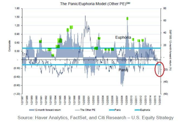
Similarly, the Citibank Panic/Euphoria model is now at a level where equities over the past 30 years have always been higher a year later. A nice feature of this model is that it has not been fooled by any bear market.
But the market is still at risk of a much larger fall. Among other reasons, we said that a bear market was unlikely at the August 2015 low because the technical pattern was incomplete. Bear markets (vertical lines) don't start with the first fall of 10% from a new high (arrows); a rebound to a failed new high followed by another fall of 10% would be bearish. Unfortunately, that's now the pattern being formed by the S&P.
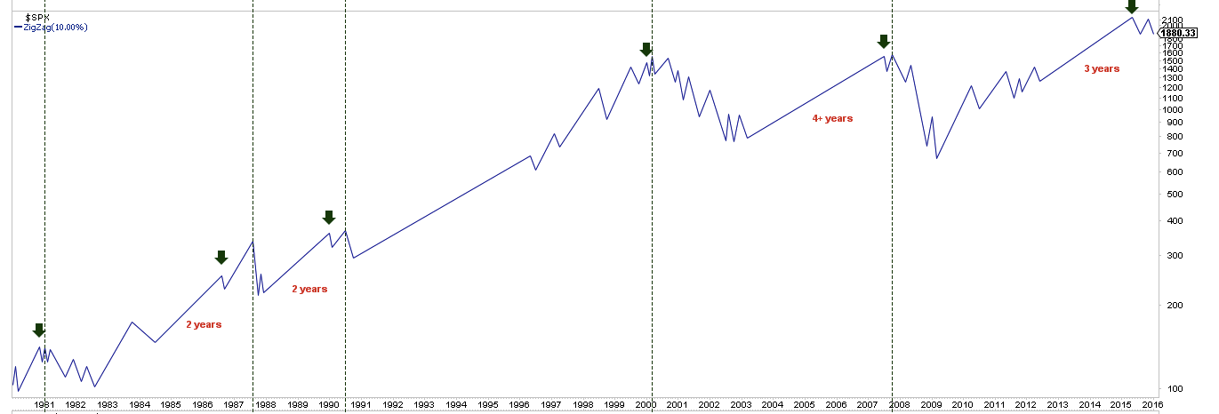
So the key question now is this: outside of the market technicals, is there a convincing case that a bear market has started?
The rest of this post attempts to answer that question. Much of the data that follows is taken from an investment outlook presentation by Goldman Sachs) Investment Management; it's a useful report that we recommend reading in full (here).
Since the second quarter of 2009, the real GDP of the US has increased at an annualized growth rate of 2.2%. The recovery is now in its seventh year, making it the fourth-longest recovery since World War II.
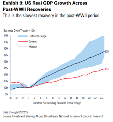
One of the knocks against the current economic background is that growth has been lethargic. Why has growth been slower than previously? There are 4 main reasons.
First, the working age population has grown markedly slower as baby boomers retire (red line, left chart). Second, households have deleveraged by 18 percentage points (blue line, right chart). Combining these two facts (slower employment and higher saving) means lower spending, and this leads to lower growth in the economy.
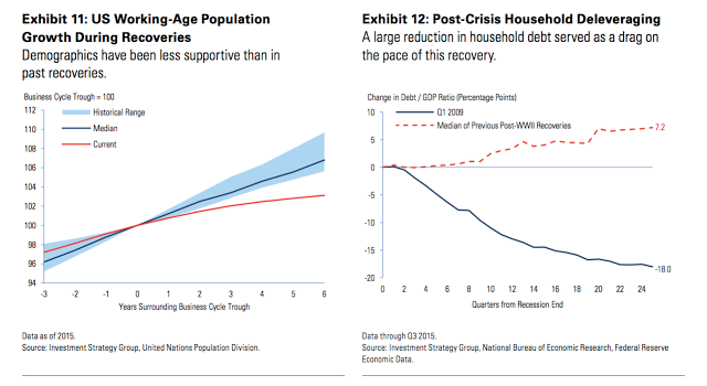
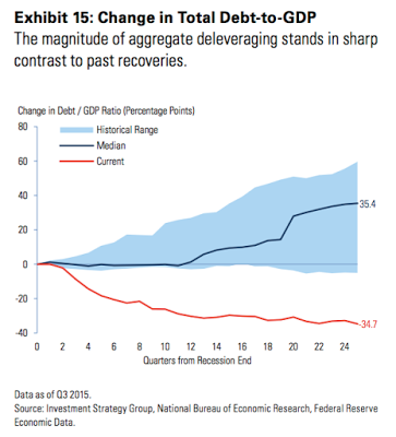
Third, the financial sector and the government have also deleveraged, in sharp contrast to past recoveries. Total debt-to-GDP has decreased by 34.7 percentage points in this cycle (red line), compared with a median increase of 35.4 percentage points in past recoveries. So, again, lower non-consumer spending has dampened growth during this cycle.
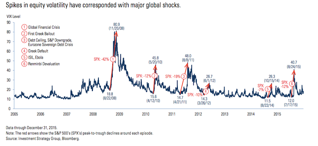
Fourth, a steady barrage of global shocks since the financial crisis have impacted growth. In contrast, the 1990s and 2000s benefited from the economic unification of Europe and the steady emergence of less developed economies, especially in Asia.
So, there are a number of non-cyclical reasons why economic growth in the US has been slower than in the past. Slow growth itself does not suggest the imminent end of the current positive cycle.
Equities have had positive price returns over a 12-month period 72% of the time historically. Of the remaining 28% of the time when the S&P 500 has posted a negative return, more than half of those periods have been associated with a recession.
The first question then is: has the Fed triggered a bear market and a recession? Probably not.
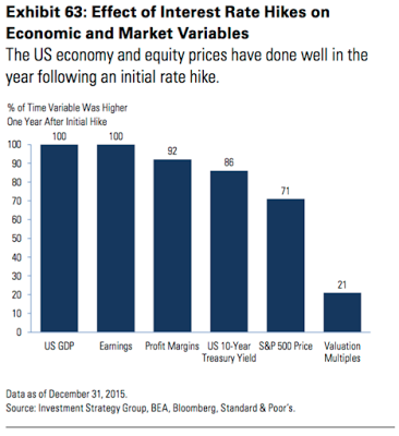
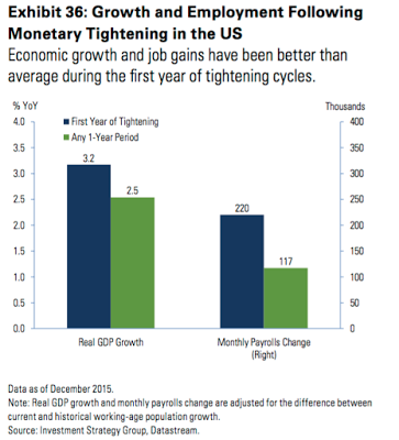
It is notable that the first year of Federal Reserve tightening cycles has been surprisingly propitious for both the economy and equity returns. Every one of the 14 post-WWII tightening cycles saw higher GDP and earnings a year later, with equities showing price gains 71% of the time.
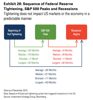
In those tightening cycles that triggered a recession and a downdraft in equities, the average lead time from the first rate hike to the onset of recession was 30 months. In this set of tightening episodes, the S&P peaked an average of 20 months after the first rate hike.
Economic growth has been better than average during the first year of tightening cycles historically, with real GDP growing 3.2% and non-farm payrolls increasing 220,000 per month.
So it would be completely unique for the recent rate hike to have marked a significant economic and market top. It's a fair point that this cycle (and Fed actions) has been different from those in the past, but that could also imply a much longer positive cycle.
In fact, that is what the balance of evidence suggests, a point we have made in our monthly economic data reviews (here). The US economy is on more solid footing than generally believed.
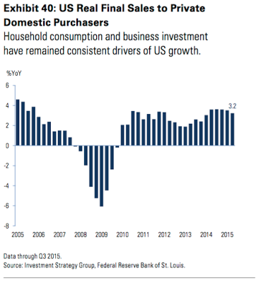
For example, real final sales to private domestic purchasers (which removes the effects of inventory shifts, government spending and net trade from GDP) have remained a consistent driver of US growth in the post-crisis period. There has been no marked weakening in private consumption growth.
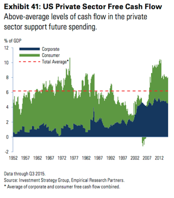
Moreover, there is ample dry powder for increased future spending given above-average levels of private sector cash flow.
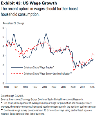
The upturn in wages should further boost consumption. Average hourly earnings growth has increased from its trough of 1.5% to 2.3% in late 2015. Leading wage indicators, such as the survey of small business compensation plans, also suggest accelerating wage growth in coming quarters.
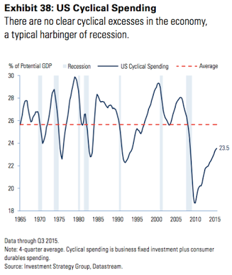
Business fixed investment and consumer durable spending are still recovering from depressed levels. There are no clear cyclical excesses in the economy, a typical harbinger of recession. If anything, there is scope for spending in cyclical parts of the US economy to increase toward the long-term average.
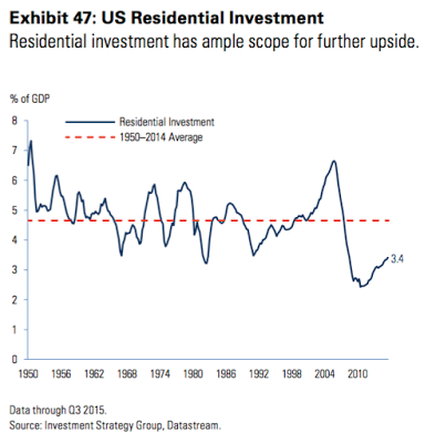
Residential investment was a much larger share of GDP at higher interest rates historically, suggesting there is significant potential for continued growth despite gradual Federal Reserve tightening.
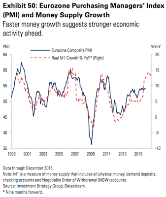
Outside the US, growth is non-recessionary. The most important region is the Eurozone, where estimated real GDP growth was 1.5% last year. Economic momentum should persist in 2016; the pace of money growth is quickening, which has proven to be a leading indicator of stronger economic activity historically.
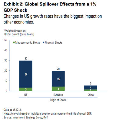
China is an oft-stated risk to the global economy, but the importance of China to the US and Europe is overstated (the next chart shows the impact of a 1% change in GDP on other economies' growth). What matters most to the US, by far, is the US economy, followed by Europe. China and other developing economies grab headlines, but are of relatively minor importance.
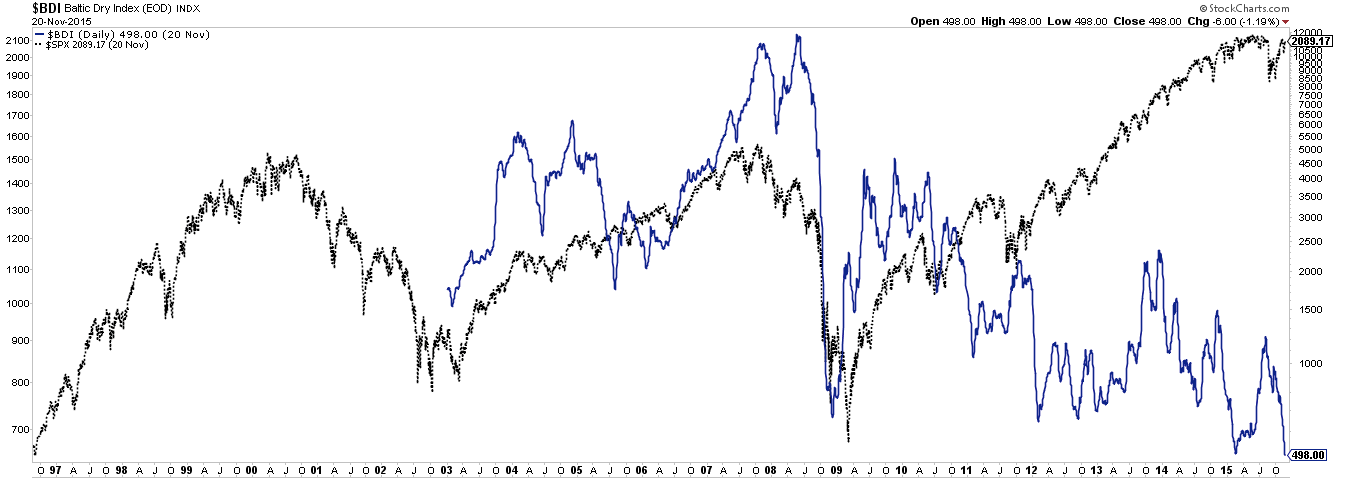
Which is why, for example, metrics like the Baltic Dry Index (BDI) are useless barometers for the US economy. If anything, a higher BDI (blue line) has corresponded to peaks in the US stock markets (black line), and low levels like today's have corresponded to the start of a new upturn.
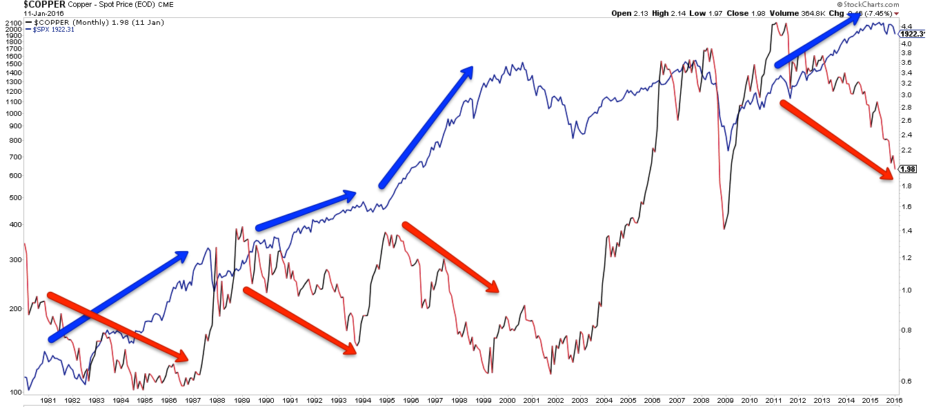
It's also worth pointing out that for all it's notoriety, the price of copper has also been a poor barometer for the US: declines in copper price (red line and arrows) have most often been associated with higher equity prices (blue line and arrows). Copper prices might be important for emerging economies, but not for the US.
Which bring us to the most important commodity of all: oil. The affect of falling oil prices on growth has been great. It is estimated that the collapse in oil prices could have subtracted up to 1% from global GDP last year by hobbling the third of capital spending that is commodity-related.
The supply-demand imbalance in the oil market is being driven primarily by an increase in world production rather than a decline in trend consumption growth. The US and Saudi Arabia are the main contributors to the boom in supply. Oil supply and demand may start to come back into balance later this year.
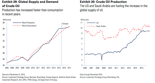
Based on a survey of the 47 largest international oil and gas companies, capital expenditures were cut by 28% last year. Large amounts of oil production remain uneconomic below $55–60 per barrel. In addition, current production levels are coming under pressure from natural decline rates. The annual change in US production is now close to flat, a marked deceleration from its 20% growth a year ago. Similarly, production growth is now slightly negative year over year in the rest of non-OPEC countries.
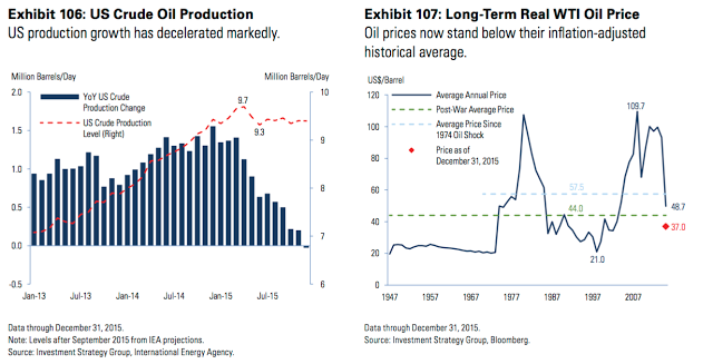
In the past, oil prices have rebounded strongly after a downdraft like that seen in 2015. To be clear, that's a statement on what has previously transpired, not a forecast for 2016.
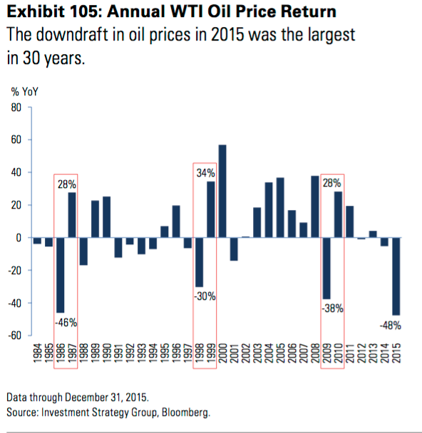
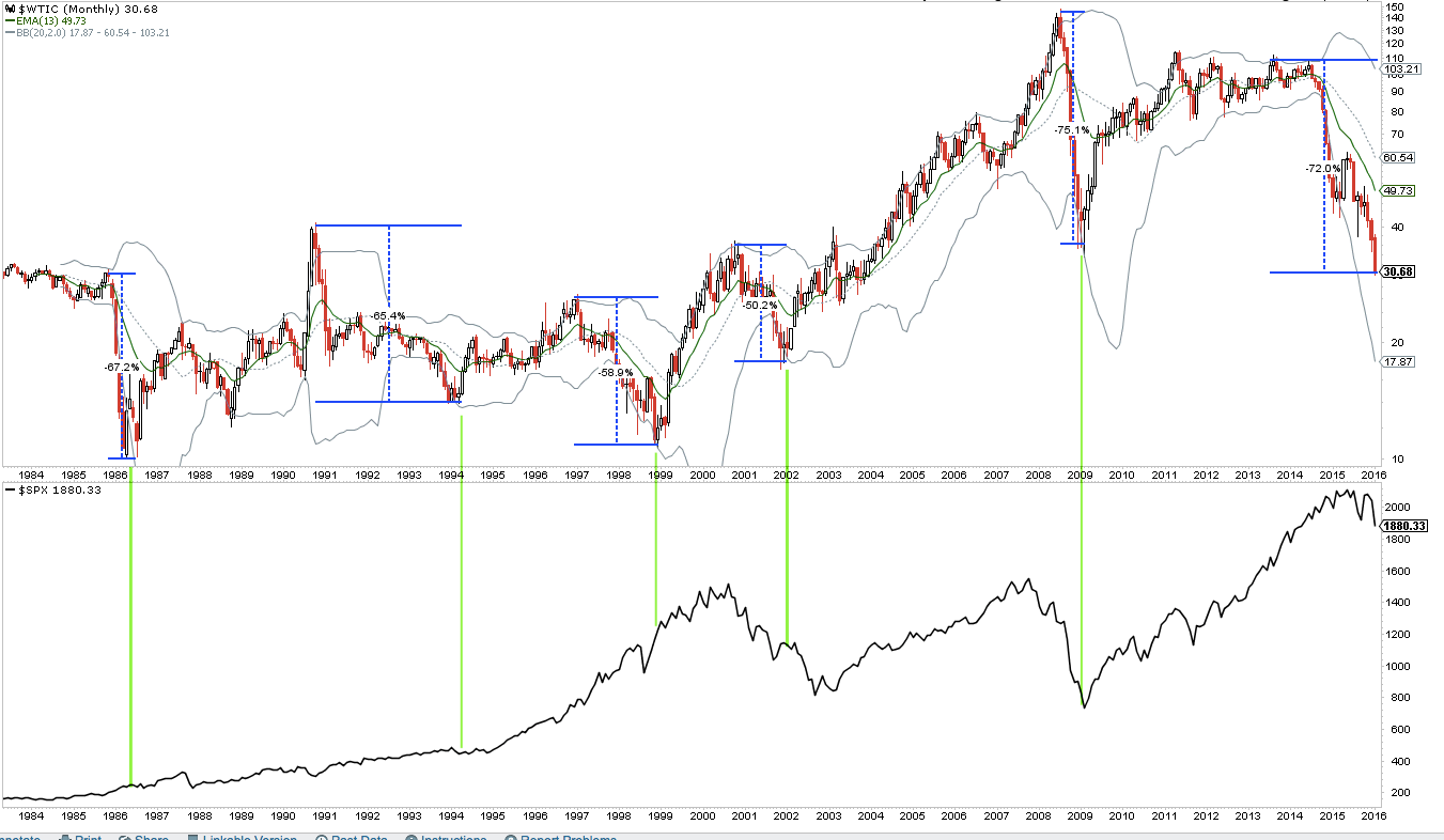
The current fall in oil, while substantial, is actually comparable to many other episodes in the past 30 years. Most of the lows in oil corresponded to higher equities in the months and years ahead (lower panel).
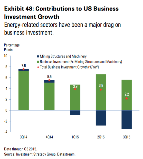
The fall in oil prices subtracted 2.4 percentage points from headline capital spending growth in 2015 in the US alone. Obviously, stabilization in oil prices would reduce the drag from energy-related investment.
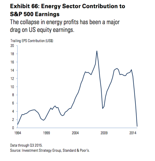
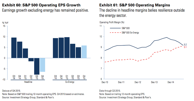
Slow growth in corporate earnings has been another concern among investors. But note that the collapse in energy sector profits subtracted almost $15 from S&P 500 earnings per share last year.
The decline in headline profits and margins in recent quarters belies resilient ex-energy fundamentals. Stated differently: there's no profit recession outside of the 10% of the S&P earnings that comes from energy.
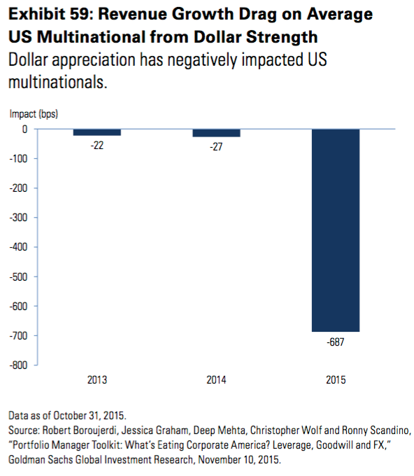
The dollar has also had a strong influence on earnings. Dollar strength alone is estimated to have cost the average US multinational almost seven percentage points in revenue growth in 2015. For the core of the S&P 500, that suggests the third quarter’s anemic 2% revenue growth would have been closer to 5% when adjusted for currency translation effects.
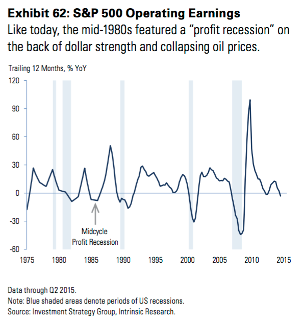
A similarly rare “profit recession” occurred in the mid-1980s on the back of dollar strength and collapsing oil prices.
Another concern for investors has been widening spreads in high yield bonds. High yield mutual fund and ETF outflows were $12b last year—representing 6% of assets under management. High yield bonds registered their first annual loss since 2008, ending a six-year streak of consecutive gains.
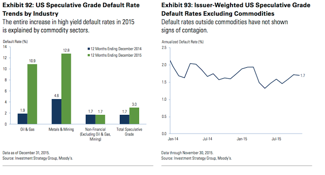
Is high yield credit sending a warning sign of broader economic deterioration? Most likely not. It may seem lackadaisical to blame the bulk of high yield’s woes on oversupplied commodity markets, but there is a bounty of evidence to support that view
Commodity sectors represented nearly three-fourths of 2015’s total high yield default volume and a similar percentage of currently distressed credits. Excluding these sectors, only 15 companies totaling $10.9 billion defaulted last year, implying a healthy ex-commodity default rate of just 0.54%. Note the entire increase in last year’s default rate can be traced to commodity areas (lhs). Default rates have shown few signs of contagion in recent quarters (rhs).
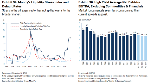
Similarly, leading indicators of defaults, such as Moody’s Liquidity Stress Index, show little stress and ample liquidity for non-commodity credits despite significant stress in oil and gas areas (lhs). Par-weighted leverage ratios for non-commodity credits are not deteriorating or worrisome (rhs).
Martin Fridson, an authority on high yield, has reached a similar conclusion (read here):
"I am inclined to be a little bit more optimistic than the calculation taken at face value, in particular because the spread is inflated by the very distressed state of the energy and metals and mining sectors. You could say that if you take out energy, the rest of the market is not indicating a particularly high recession risk."
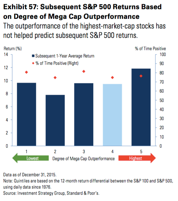
A final concern for investors has been the outperformance of large capitalization stocks. The outperformance of the largest-market-capitalization stocks last year is said to reflect the kind of narrowing participation typically seen at market tops. Is this a valid concern? No.
The relative returns of the largest 100 stocks has virtually no bearing on the subsequent one-year performance of the S&P 500. Moreover, market breadth has been an unreliable indicator of a recession or market peak. Of the 11 historical narrow-breadth episodes, seven resulted in higher S&P 500 prices one year later, with a median gain of 9%.
The US economy is still expanding. The historical odds of a positive annual stock market return outside a recession have been more than 85% in the post-WWII period. Over this same time period, nearly three-fourths of the bear markets occurred during recessions. With few signs of an economic contraction on the horizon, these odds continue to work in investors’ favor.
