Year Of Whipsaws
Blair Jensen | Jan 04, 2016 01:35AM ET
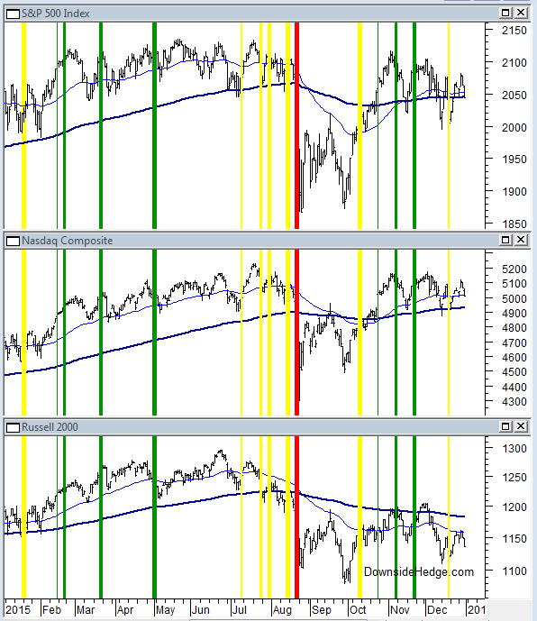
2015 was a year of whipsaws for the core portfolios. Take a look at the chart below and you’ll see the allocation changes throughout the year. Green lines represent adding exposure, yellow reducing exposure (or adding a hedge), and red represents a market risk warning. The core portfolios added exposure early in the year only to reduce it just before the August drop. It was nice to sleep at night during the turbulence, but it didn’t help the portfolios much because we then added exposure just before the market started to dip again. If you were holding small caps the changes were more painful than if your portfolio was closer to Nasdaq or the S&P 500 Index (SPX). Overall, the portfolios did as expected in a flat year for the market. Without a direction, whipsaws are expected.
The important thing to notice on the chart is that the core portfolios were 100% in cash or 50% long and 50% short just before the decline in August. In contrast, my market risk indicator didn’t signal until 8/21/15, which was the halfway point of the decline. Unless an event comes out of nowhere, it’s common for the core portfolios to be more cautious than the market risk indicator. As a result, the core changes will have more whipsaws, but the market risk indicator will lose more off the top before reducing exposure. Keep that in mind as you structure your own portfolios.
Now for the performance numbers. The S&P 500 Index (SPX) lost .73%, giving it a basically flat year. The Long / Short Hedged portfolio was our worst performer with a loss of 6.44%. The loss was mainly due to lagging performance of the longs in the last half of the year. They just didn’t rally much after the August decline. This portfolio has had a tough time as the market has moved sideways.
The Long / Cash portfolios performed the best, but still suffered losses of 3.2%. Since the Long / Cash portfolios were 100% in cash before the market risk indicator warned, it had no effect on the Long / Cash portfolio that recognizes market risk. The long term performance of SPX has finally caught up with both of these portfolios. The last time that happened the market was near a significant top (not a prediction, just an observation).
The volatility hedged portfolio fell 4.13% in 2015. This portfolio suffered due to a market risk warning that wasn’t followed by sustained weakness. The hedge (N:XVZ for official tracking purposes – but you can use N:VXZ) had a loss during the period of the risk warning. However, this portfolio did just as expected. It hedged when the risk of a more severe sell off increased.
Conclusion
A flat year caused the core portfolios to whipsaw and lose a bit more than the market. The steep decline in August caused a whipsaw for the volatility hedged portfolio. Let’s hope the market picks a direction in 2016…and of course, we don’t care which direction it takes. Good Luck in the New Year!!
Trading in financial instruments and/or cryptocurrencies involves high risks including the risk of losing some, or all, of your investment amount, and may not be suitable for all investors. Prices of cryptocurrencies are extremely volatile and may be affected by external factors such as financial, regulatory or political events. Trading on margin increases the financial risks.
Before deciding to trade in financial instrument or cryptocurrencies you should be fully informed of the risks and costs associated with trading the financial markets, carefully consider your investment objectives, level of experience, and risk appetite, and seek professional advice where needed.
Fusion Media would like to remind you that the data contained in this website is not necessarily real-time nor accurate. The data and prices on the website are not necessarily provided by any market or exchange, but may be provided by market makers, and so prices may not be accurate and may differ from the actual price at any given market, meaning prices are indicative and not appropriate for trading purposes. Fusion Media and any provider of the data contained in this website will not accept liability for any loss or damage as a result of your trading, or your reliance on the information contained within this website.
It is prohibited to use, store, reproduce, display, modify, transmit or distribute the data contained in this website without the explicit prior written permission of Fusion Media and/or the data provider. All intellectual property rights are reserved by the providers and/or the exchange providing the data contained in this website.
Fusion Media may be compensated by the advertisers that appear on the website, based on your interaction with the advertisements or advertisers.