Weaving Point And Figure With Candlesticks In The SPX
Dragonfly Capital | Sep 29, 2016 07:37AM ET
Renko charts are a bit of a hybrid from my vantage point between Candlestick charts and Point and Figure charts. From the short term perspective, against the daily candlesticks, a Renko chart smooths the change in price. A change is made by adding a green or red brick only when the price has moved outside of a preset range. The most common case is to use the 14 period Average True Range (ATR), a measure of volatility, for the brick size.
It is also similar to a Point and Figure chart in that it does not pay strict attention to time. It may take weeks for a new brick to print, but it still only prints one brick. This means the lower axis of the chart is not a fluid flow of time. This means the more volatile a timeframe the longer it will appear on a chart, like a Point and Figure chart that alternates a lot between X’s and O’s.
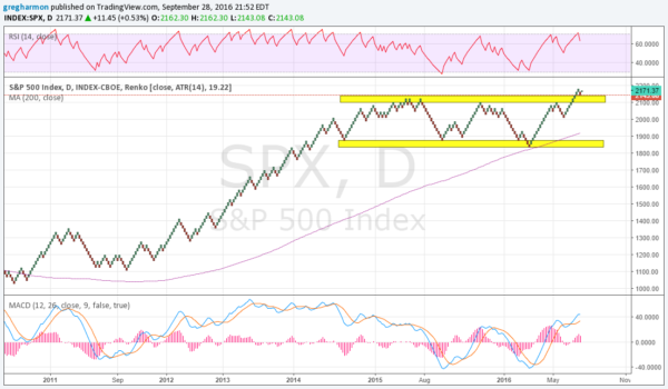
So reviewing the Renko chart above for the S&P 500 over the time since the 2011 correction can add some perspective. The chart above can do that. It shows the steady trend higher from the 2011 pullback to the high in 2015. It also shows how the chart morphed into a consolidation channel. That channel held, between about 1850 and 2100, for almost 2 years until July. The break above at that point came back and retested the breakout before reversing just this week.
Momentum indicators on this chart remain in bullish zones. The RSI has pulled back from an overbought condition, while the MACD is moving up. The Index is over its 200 brick moving average and that SMA is rising. There may be a further back and forth pullback in this Index, but the prospects for more upside look strong. And a print over 2182 will gather more money to the Index.
DISCLAIMER: The information in this blog post represents my own opinions and does not contain a recommendation for any particular security or investment. I or my affiliates may hold positions or other interests in securities mentioned in the Blog, please see my Disclaimer page for my full disclaimer.
![]()
Trading in financial instruments and/or cryptocurrencies involves high risks including the risk of losing some, or all, of your investment amount, and may not be suitable for all investors. Prices of cryptocurrencies are extremely volatile and may be affected by external factors such as financial, regulatory or political events. Trading on margin increases the financial risks.
Before deciding to trade in financial instrument or cryptocurrencies you should be fully informed of the risks and costs associated with trading the financial markets, carefully consider your investment objectives, level of experience, and risk appetite, and seek professional advice where needed.
Fusion Media would like to remind you that the data contained in this website is not necessarily real-time nor accurate. The data and prices on the website are not necessarily provided by any market or exchange, but may be provided by market makers, and so prices may not be accurate and may differ from the actual price at any given market, meaning prices are indicative and not appropriate for trading purposes. Fusion Media and any provider of the data contained in this website will not accept liability for any loss or damage as a result of your trading, or your reliance on the information contained within this website.
It is prohibited to use, store, reproduce, display, modify, transmit or distribute the data contained in this website without the explicit prior written permission of Fusion Media and/or the data provider. All intellectual property rights are reserved by the providers and/or the exchange providing the data contained in this website.
Fusion Media may be compensated by the advertisers that appear on the website, based on your interaction with the advertisements or advertisers.