Visualizing GDP: A Look Inside The Q3 Second Estimate
Doug Short | Nov 26, 2014 06:30AM ET
Note from dshort: The charts in this commentary have been updated to include the Q3 2014 Second Estimate.
The chart below is my way to visualize real GDP change since 2007. I've used a stacked column chart to segment the four major components of GDP with a dashed line overlay to show the sum of the four, which is real GDP itself. Here is the latest overview from the Bureau of Labor Statistics:
The increase in real GDP in the third quarter primarily reflected positive contributions from personal consumption expenditures (PCE), exports, nonresidential fixed investment, federal government spending, and state and local government spending that were partly offset by a negative contribution from private inventory investment. Imports, which are a subtraction in the calculation of GDP, decreased.
Let's take a closer look at the contributions of GDP of the four major subcomponents. My data source for this chart is the Excel file accompanying the BEA's latest GDP news release (see the links in the right column). Specifically, I used Table 2: Contributions to Percent Change in Real Gross Domestic Product.
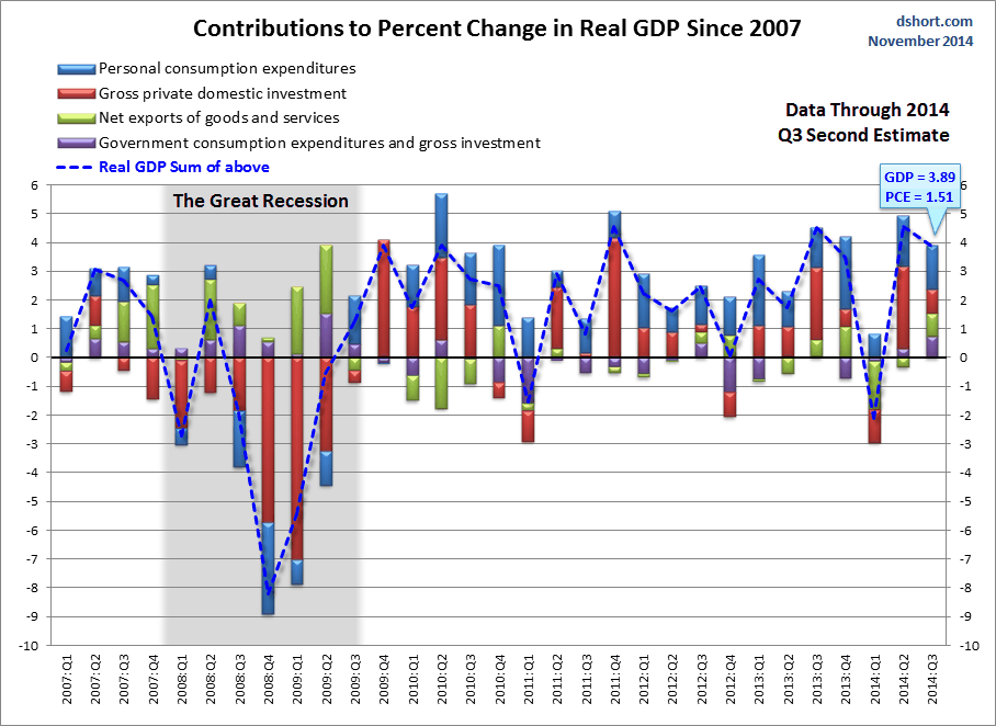
Note: The conventional practice is to round GDP to one decimal place, the latest at 3.5. The 3.55 GDP in the chart above is the real GDP calculated to two decimal places based on the BEA chained 2009 dollar data series.
Over the time frame of this chart, the Personal Consumption Expenditures (PCE) component has shown the most consistent correlation with real GDP itself. When PCE has been positive, GDP has usually been positive, and vice versa. In the latest GDP data, the contribution of PCE came at 1.51 of the 3.89 real GDP. The Q3 contribution from PCE declined from 1.75 in the previous quarter.
The latest GDP numbers continue to support the general view that the unusually severe winter was a transitory cause of the Q1 GDP contraction rather than fundamental business cycle weakness.
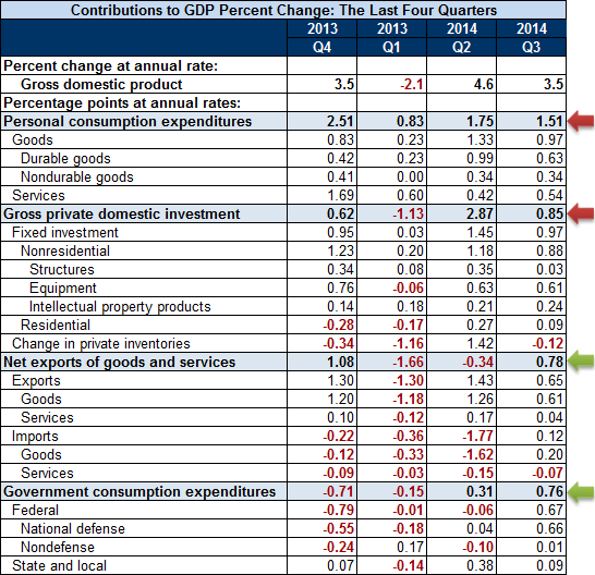
Here is a look at the contribution changes between over the past four quarters. The difference between the two rightmost columns was addressed in the GDP summary quoted above. I've added arrows to highlight the quarter-over-quarter change for the major components.
As for the role of Personal Consumption Expenditures (PCE) in GDP and how it has increased over time, here is a snapshot of the PCE-to-GDP ratio since the inception of quarterly GDP in 1947. The latest ratio is 67.9%, fractionally below the all-time high of 68.7% in Q1 2011. From a theoretical perspective, there is a point at which personal consumption as a percent of GDP can't really go any higher. We may be hovering in that upper range.
Let's close with a look at the inverse behavior of PCE and Gross Private Domestic Investment (GPDI) during recessions. PCE generally increases as a percent of GDP whereas GPDI declines. That is not what we've been seeing in recent quarters. Note that I've plotted the two with different vertical axes (PCE on left, GPDI on the right) to highlight the frequent inverse correlation.
The Third Estimate for Q3 GDP will published on December 23.
Trading in financial instruments and/or cryptocurrencies involves high risks including the risk of losing some, or all, of your investment amount, and may not be suitable for all investors. Prices of cryptocurrencies are extremely volatile and may be affected by external factors such as financial, regulatory or political events. Trading on margin increases the financial risks.
Before deciding to trade in financial instrument or cryptocurrencies you should be fully informed of the risks and costs associated with trading the financial markets, carefully consider your investment objectives, level of experience, and risk appetite, and seek professional advice where needed.
Fusion Media would like to remind you that the data contained in this website is not necessarily real-time nor accurate. The data and prices on the website are not necessarily provided by any market or exchange, but may be provided by market makers, and so prices may not be accurate and may differ from the actual price at any given market, meaning prices are indicative and not appropriate for trading purposes. Fusion Media and any provider of the data contained in this website will not accept liability for any loss or damage as a result of your trading, or your reliance on the information contained within this website.
It is prohibited to use, store, reproduce, display, modify, transmit or distribute the data contained in this website without the explicit prior written permission of Fusion Media and/or the data provider. All intellectual property rights are reserved by the providers and/or the exchange providing the data contained in this website.
Fusion Media may be compensated by the advertisers that appear on the website, based on your interaction with the advertisements or advertisers.