Unnerving Market Excess In 3 Charts
Gary Gordon | Feb 15, 2021 02:41AM ET
Extremely easy access to cheap money. That’s what inflated the dotcom blimp in the late 1990s. That’s what pumped up the housing balloon in the 2000s. And that’s what is responsible for the “Everything Bubble” today.
How frothy? Here are three charts that delineate the obscene particulars:
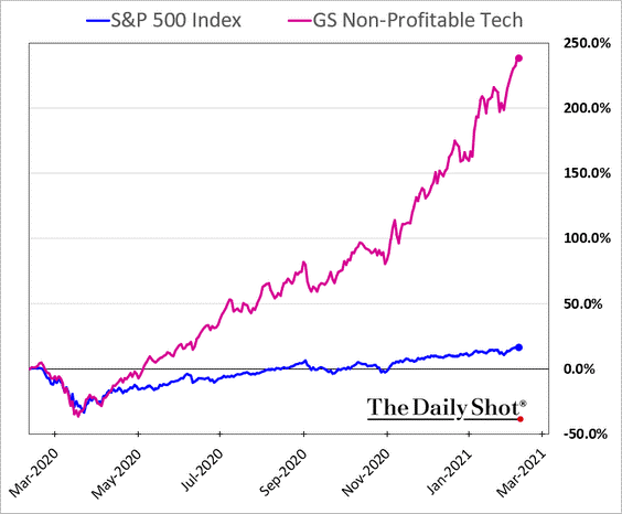
(1) No Profits, No Problem. The history of stock returns comes in at around 9.5% annualized. Throughout most of that time, profitable entities served up dividends that provided about two-fifths of the total return. Year-over-year price appreciation might have been responsible for 5.5% of the 9.5%.
Over the last year, technology companies that lose money hand over fist did not merely gain 5.5%. They did not merely match the 16% gains for the broader S&P 500. No, they catapulted nearly 250% from mid-February 2020 to mid-February 2021.
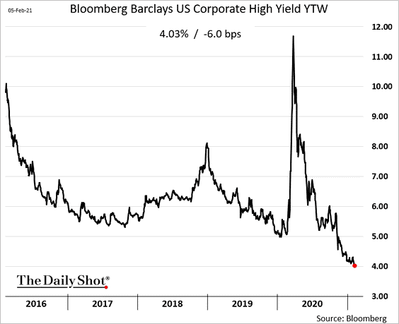
(2) The Trashier, The Better. Junk bonds represent corporations with the weakest balance sheets. Some of them, affectionately named “zombies,” struggle to earn enough income to pay the interest on obligations, let alone pay off debts in their entirety.
Yet investors feel they have no choice. They are starved for income with few options that earn a positive, inflation-adjusted, return. Consequently, highly indebted corporations with the poorest prospects are getting away with offering market participants sub-4% yielding securities.
(3) Crypto Craziness. What really justifies a 500% gain over six months? A hedge against the loss of purchasing power for the U.S. dollar? The likelihood of widespread Bitcoin adaptation in the future?
Regardless of whether crypto is or is not a viable store of value, parabolic moves rarely reflect common sense. This asset’s meteoric explosion speaks more to the endless money printing liquidity by the Federal Reserve and the crypto-pumping tweets by Elon Musk than to rational price movement.
Trading in financial instruments and/or cryptocurrencies involves high risks including the risk of losing some, or all, of your investment amount, and may not be suitable for all investors. Prices of cryptocurrencies are extremely volatile and may be affected by external factors such as financial, regulatory or political events. Trading on margin increases the financial risks.
Before deciding to trade in financial instrument or cryptocurrencies you should be fully informed of the risks and costs associated with trading the financial markets, carefully consider your investment objectives, level of experience, and risk appetite, and seek professional advice where needed.
Fusion Media would like to remind you that the data contained in this website is not necessarily real-time nor accurate. The data and prices on the website are not necessarily provided by any market or exchange, but may be provided by market makers, and so prices may not be accurate and may differ from the actual price at any given market, meaning prices are indicative and not appropriate for trading purposes. Fusion Media and any provider of the data contained in this website will not accept liability for any loss or damage as a result of your trading, or your reliance on the information contained within this website.
It is prohibited to use, store, reproduce, display, modify, transmit or distribute the data contained in this website without the explicit prior written permission of Fusion Media and/or the data provider. All intellectual property rights are reserved by the providers and/or the exchange providing the data contained in this website.
Fusion Media may be compensated by the advertisers that appear on the website, based on your interaction with the advertisements or advertisers.