Market Charts Too Good To Be True?
Tim Knight | Oct 21, 2015 12:34AM ET
Well, it’s confession time: I’m scared.
I know that, as the designated martyr for equity bears, I should show more steely-eyed steadfastness, but the past six years have put the zap on my brain, and memories of what this guy did a year ago still haunt me.
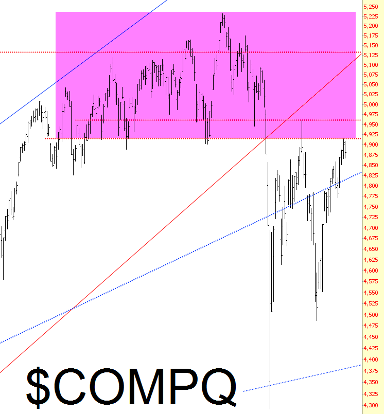
In a strange way, though, my fear is borne from the suspicion that the charts I am seeing are simply too good to be true. If I were to contribute a chapter to a book on charting called This Is What A Top Looks Like, the hypothetical, idealized charts would look like this (the NASDAQ Composite):
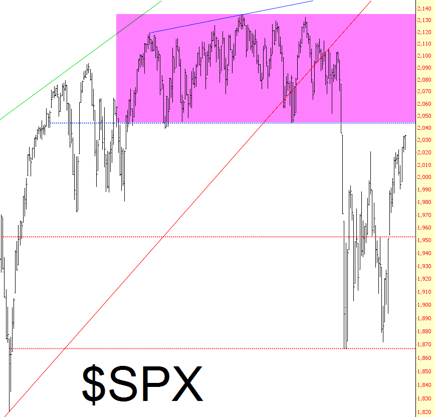
………and this…(the S&P 500)
………..and this…(Dow Jones Composite)
But, as I’ve intimated, it’s Central Banking Shenanigans that have given me sleepless nights, and next week is when I’m really going to start getting woozy. Witness this maelstrom next Wednesday and Thursday:
I’m actually considering our own FOMC meeting to be a pointless joke, since they won’t change one iota of their last statement. It’s Japan that I’m worried about.
Of course, this could all be much ado about nothing, because – – as with the 17th of September – – the central bankers could unwittingly offer up exactly what the bears need to really get the ball rolling. But I’ve been so frustrated – and impatient! – waiting for the tide to once more turn south, I’m starting to feel my will slip away. Lord knows that fear has completely exited the market since August 24th.
If nothing else, I’ll try to remember what’s on my site’s own rules page .
Trading in financial instruments and/or cryptocurrencies involves high risks including the risk of losing some, or all, of your investment amount, and may not be suitable for all investors. Prices of cryptocurrencies are extremely volatile and may be affected by external factors such as financial, regulatory or political events. Trading on margin increases the financial risks.
Before deciding to trade in financial instrument or cryptocurrencies you should be fully informed of the risks and costs associated with trading the financial markets, carefully consider your investment objectives, level of experience, and risk appetite, and seek professional advice where needed.
Fusion Media would like to remind you that the data contained in this website is not necessarily real-time nor accurate. The data and prices on the website are not necessarily provided by any market or exchange, but may be provided by market makers, and so prices may not be accurate and may differ from the actual price at any given market, meaning prices are indicative and not appropriate for trading purposes. Fusion Media and any provider of the data contained in this website will not accept liability for any loss or damage as a result of your trading, or your reliance on the information contained within this website.
It is prohibited to use, store, reproduce, display, modify, transmit or distribute the data contained in this website without the explicit prior written permission of Fusion Media and/or the data provider. All intellectual property rights are reserved by the providers and/or the exchange providing the data contained in this website.
Fusion Media may be compensated by the advertisers that appear on the website, based on your interaction with the advertisements or advertisers.