These Are Not Signs Of A Healthy Market
Charles Hugh Smith | Sep 06, 2019 01:43AM ET
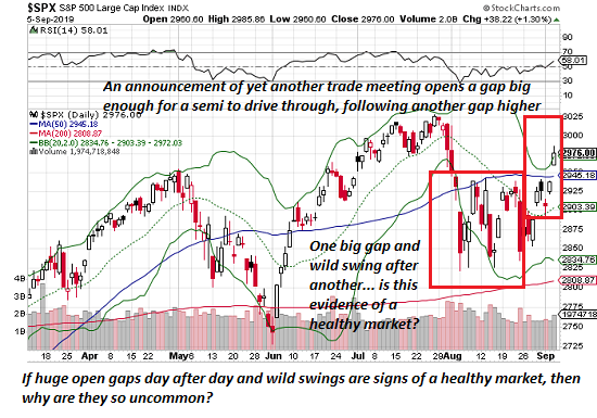
If these three charts reflect a "normal" "healthy" Bull market, then why are they so uncommon?
The implicit narrative of the latest rally in stocks is that this is just another normal rally in the ongoing 10-year long Bull market. Nice, but do these three charts look "normal" to you? Let's take a quick glance at a daily chart of the S&P 500, a weekly chart of iShares 20+ Year Treasury Bond (NASDAQ:TLT), the exchange-traded fund of the US Treasury 20-year bond, and silver.
In other words, let's look at three different assets: stocks, bonds and one of the precious metals.
Even the most cursory glance reveals there is nothing normal about any of these charts. The recent action in the SPX is anything but normal: yet another announcement of yet another (low-level nothing-burger) trade meeting opens a gap big enough for a semi to drive through, punching through the upper Bollinger Band®, and on the heels of a previous big gap up, also on no fundamental news.
Look at August: if a month of nearly daily open gaps and manic swings is "normal," why are such periods so uncommon in "normal" rallies? Looking at August's wild schizophrenia, does this strike you as "normal" market action in an ongoing Bull market? If so, perhaps you should dial back your Ibogaine consumption.
Next up, TLT, the US Treasury long bond. You know, the "safe" long bond, which moves glacially compared to risk-on stocks.
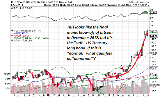
If we dare to be honest (risky in a world terrified of honesty), this looks like the blow-off topping move of risk-on bitcoin in December 2017. There is nothing "normal" about this parabolic move in Treasury bonds.
Now let's consider silver, like its precious metal sibling gold, traditionally a hedge against currency devaluations and other risky spots of bother. Since when is a parabolic move higher in the precious metals a sign of a healthy stock market rally or healthy economy?
Um, how about "never"? Let's face it, these are not charts of a healthy stock market. They're signs of the manic uncertainty and frenzied churn of traders desperately seeking the next parabolic rally in risk-off hedges.
Again--if these three charts reflect a "normal" "healthy" Bull market, then why are they so uncommon? Quick, let's talk about liquidity (good), dovish central banks (better) and trade deal rumors (best).
That the entire stock market rally rests on empty rumors and recycled central bank happy talk is beyond pathetic. There is nothing normal or healthy in these charts or in a pathological reliance on addled double-speak to push stocks higher.
Trading in financial instruments and/or cryptocurrencies involves high risks including the risk of losing some, or all, of your investment amount, and may not be suitable for all investors. Prices of cryptocurrencies are extremely volatile and may be affected by external factors such as financial, regulatory or political events. Trading on margin increases the financial risks.
Before deciding to trade in financial instrument or cryptocurrencies you should be fully informed of the risks and costs associated with trading the financial markets, carefully consider your investment objectives, level of experience, and risk appetite, and seek professional advice where needed.
Fusion Media would like to remind you that the data contained in this website is not necessarily real-time nor accurate. The data and prices on the website are not necessarily provided by any market or exchange, but may be provided by market makers, and so prices may not be accurate and may differ from the actual price at any given market, meaning prices are indicative and not appropriate for trading purposes. Fusion Media and any provider of the data contained in this website will not accept liability for any loss or damage as a result of your trading, or your reliance on the information contained within this website.
It is prohibited to use, store, reproduce, display, modify, transmit or distribute the data contained in this website without the explicit prior written permission of Fusion Media and/or the data provider. All intellectual property rights are reserved by the providers and/or the exchange providing the data contained in this website.
Fusion Media may be compensated by the advertisers that appear on the website, based on your interaction with the advertisements or advertisers.