Taxable Fixed Income: A Year In Review
Cumberland Advisors | Dec 24, 2014 10:25AM ET
Taxable fixed-income markets continued to perform well for the last quarter of 2014. If one thing remained consistent throughout the year, it was the duration of the unexpected fixed-income rallies. Geopolitical risks, global economic disappointments, and every incremental step toward stronger domestic economic conditions spurred and maintained a strong “flight to quality” in US debt, thus keeping rates down.
The first part of the year seemed to be dominated by Russian President Vladimir Putin and his aggressive stance toward Crimea and Ukraine. Despite all the sanctions the West imposed upon Russia, President Putin would not stand down and accede to the demands of the international community. These actions and aggressive attitudes fomented continued uncertainty in the marketplace. ISIS, Iraq, the missing Malaysian Airlines passenger jet, the Malaysian Airliner shot down in Ukraine, lackluster economic data in global markets, and almost-certain QE in the European region expected for next year all compounded that uncertainty. In the first two weeks into December, the extreme drop in oil prices and a collapsing Russian ruble carried the headlines, though neither proved enough to deter President Putin from his defiant agenda.
In the United States, this last quarter saw domestic turbulences resulting in protests spreading across the country, a change in FOMC language indicating that the Committee will be “patient” with regard to rate increases, new talk of strengthened relations between United States and Cuba, and stronger economic data with respect to GDP, lower unemployment, and low inflation concerns.
The Curve
As we analyze the past year in taxable fixed-income bonds, we must examine the foundations of the Treasury curve, since taxable fixed-income asset yields are benchmarked from their Treasury counterparts.
The graph below provides a quick look at how the Treasury market was impacted over the course of this year as compared to last. The green line represents the yield curve as of 12/21/2014, whereas the yellow line represents the yield curve as of 12/21/2013. We ended 2013 with a 30-year Treasury close to 4% and a 10-year at around 3%. At the close of 2013, the majority of market participants expected that we would feel the impact of increased rates in 2014 as a result of the Federal Reserve’s beginning to raise rates. As the graph confirms, this is not what occurred. Instead, fixed-income rallies pushed rates down along the curve from the 5-year tenors (maturities) out to the 30-year, flattening the curve. Shorter-term tenors (less than 2 years) maintained a more or less flat disposition, unchanged from last December; however, when we move towards the “belly” (2–5 year tenors), we see a higher-rate environment relative to the same period last year.
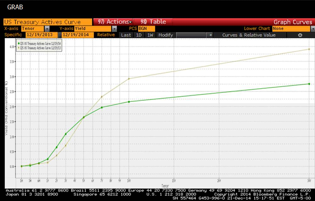
Source: Bloomberg
Throughout 2014, the “flight to quality” was driven in most cases by the concatenation of geopolitical events, economic pressures, and policy constraints in global market environments. That said, we would like to further examine the attractiveness of US sovereign debt.
Yields
Our next chart depicts yields for U.S. 10-Year debt compared to global alternatives. US yields maintained strong relative value throughout the year, offering significant yield pickup to most sovereigns and closing the year yielding 2.16% for 10-year debt. Outperforming exceptions include New Zealand and Australia, at 3.72% and 2.93% respectively.
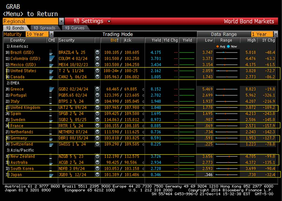
Source: Bloomberg
We were also able to observe attractive yields in the 30-year space, with last week’s reopening of 30-year offering a 2.86% yield compared to alternative sovereign 30-year rates, including Canada offering at 2.40%, France 1.98%, Germany 1.52%, and Japan 1.37%.
Treasury market rallies throughout the year offered nice appreciation for taxable fixed-income holdings. New issue supply in both taxable municipals and investment-grade corporates provided opportunities for execution and entry into new positions. At times the secondary markets presented challenges for new positions as areas of interest along the curve yielded expensive acquisition prices (generally within the 3-5 year tenors). This, of course, meant that at times we had to be even more judicious and diligent in asset selection in order to take advantage of opportunities when market selloffs offered attractive points of acquisition. These opportunities presented themselves at times throughout the year but have materialized most recently within the investment-grade corporate space in bond issues relating to the energy sector.
The impact of dropping oil prices has most definitely impacted high-yield assets and their immediate market deterioration. Among investment-grade assets, we were able to observe significant spread widening in single-A-rated bonds among energy-related issues, which in some cases offered very attractive prices for positioning assets. Specifically, we observed this within the 5-year tenors as we saw AAA assets trade at extreme tights to Treasury counterparts, thus barely yielding 1.5% for a 5-year investment. Furthermore, AA-rated bonds were observed trading somewhat wider at 30 to 40 basis points to benchmark Treasuries and yielding barely 2% for a 5-year investment. However, further research reveals that, for some single-A-rated issues, corporate spreads widened 75 bps after oil prices plummeted and were trading at spread levels as wide as 240 to their benchmark Treasury yields, thus offering close to 4% yield for 5-year investments. Opportunities such as these seemed few and far between throughout 2014; however, we opted to acquire assets when we could.
As we move into 2015, we are pleased with our strategic preparations and the duration-shortening decisions we made early on for our taxable fixed-income portfolios. Defensively configured portfolios are better positioned to withstand the added volatilities expected when the Fed begins increasing short-term rates. While we may not know exactly when the Fed will initiate rate increases, we do feel comfortable expecting this to happen toward the middle of 2015. We will continue to monitor market conditions, economic data, and FOMC language and to make tactical changes to overall portfolio strategies as circumstances dictate and we deem necessary.
Nannette Sabo is a Portfolio Manager & Vice President - Taxable Fixed Income Trading of Cumberland. Her bio is found at Cumberland’s home page, Nannette.Sabo@cumber.com.
From all of us at Cumberland Advisors, we wish everyone a happy, healthy, and safe holiday season.
Nannette Sabo, Vice President & Portfolio Manager - Fixed Income
Trading in financial instruments and/or cryptocurrencies involves high risks including the risk of losing some, or all, of your investment amount, and may not be suitable for all investors. Prices of cryptocurrencies are extremely volatile and may be affected by external factors such as financial, regulatory or political events. Trading on margin increases the financial risks.
Before deciding to trade in financial instrument or cryptocurrencies you should be fully informed of the risks and costs associated with trading the financial markets, carefully consider your investment objectives, level of experience, and risk appetite, and seek professional advice where needed.
Fusion Media would like to remind you that the data contained in this website is not necessarily real-time nor accurate. The data and prices on the website are not necessarily provided by any market or exchange, but may be provided by market makers, and so prices may not be accurate and may differ from the actual price at any given market, meaning prices are indicative and not appropriate for trading purposes. Fusion Media and any provider of the data contained in this website will not accept liability for any loss or damage as a result of your trading, or your reliance on the information contained within this website.
It is prohibited to use, store, reproduce, display, modify, transmit or distribute the data contained in this website without the explicit prior written permission of Fusion Media and/or the data provider. All intellectual property rights are reserved by the providers and/or the exchange providing the data contained in this website.
Fusion Media may be compensated by the advertisers that appear on the website, based on your interaction with the advertisements or advertisers.