The State Of U.S. Stocks In 1 Chart
Arnout Ter Schure | Apr 18, 2018 12:48PM ET
Often simple is best. And when we want to assess and understand how the major US indices are doing, a simple line chart with the two key trend lines will do. Below I've plotted the line charts of S&P 500, DJIA, NYSE, NASDAQ and Russell 2000, which I shared with my Premium Members yesterday. These indices cover the broad markets to tech to small cap and line charts are based on closing prices only, thus taking all the intra-day noise away; nice, clean, simple and easy to understand
Technical Lines In The Sand
Two lines are distinct and easy to spot: the red lines capture the price declines from the all-time highs (ATHs) and the green lines capture the retest – either higher or lower – of the low made in early February this year. These are, therefore, the defining Bull-Bear lines in the sand: over the red line and price is breaking out; below the green line and price is breaking down. In between the two and price is essentially moving sideways.
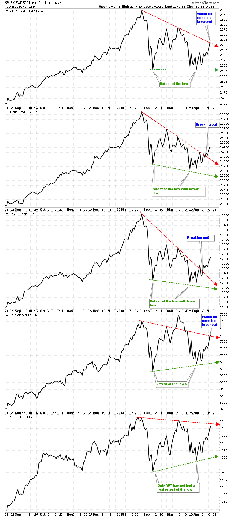
So what do we see? Price has broken out on the DJIA and NYSE and is trying to break out on the S&P and NAS. The RUT has a little more work to do but is getting close. Given that 2 of the 5 major indices have already broken out and 2 others are working on it, we can expect the RUT to follow suit.
Bears want to see a 2nd retest of the February low, but the market hardly ever revisits an important low twice. It's not impossible, but much less likely to happen. What is much more likely, based on these charts, is that price will continue to move higher over the days and weeks to come – within the markets natural ebb and flow – as it is breaking out. Those are the facts at hand. Wishful thinking doesn't make markets, but it cand and will generate poor trading results.
Bottom Line
These Breakouts Are Bullish, Not Bearish
Good charting and trading!
Arnout aka Soul
Trading in financial instruments and/or cryptocurrencies involves high risks including the risk of losing some, or all, of your investment amount, and may not be suitable for all investors. Prices of cryptocurrencies are extremely volatile and may be affected by external factors such as financial, regulatory or political events. Trading on margin increases the financial risks.
Before deciding to trade in financial instrument or cryptocurrencies you should be fully informed of the risks and costs associated with trading the financial markets, carefully consider your investment objectives, level of experience, and risk appetite, and seek professional advice where needed.
Fusion Media would like to remind you that the data contained in this website is not necessarily real-time nor accurate. The data and prices on the website are not necessarily provided by any market or exchange, but may be provided by market makers, and so prices may not be accurate and may differ from the actual price at any given market, meaning prices are indicative and not appropriate for trading purposes. Fusion Media and any provider of the data contained in this website will not accept liability for any loss or damage as a result of your trading, or your reliance on the information contained within this website.
It is prohibited to use, store, reproduce, display, modify, transmit or distribute the data contained in this website without the explicit prior written permission of Fusion Media and/or the data provider. All intellectual property rights are reserved by the providers and/or the exchange providing the data contained in this website.
Fusion Media may be compensated by the advertisers that appear on the website, based on your interaction with the advertisements or advertisers.