These Charts Support Long-Term Bullish Case
Chris Ciovacco | May 30, 2017 01:50PM ET
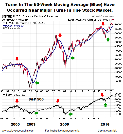
Similarities To Previous Major Market Turns
The chart below shows up/down volume (1998-2017) for the NYSE Composite, along with its 50-week moving average (thick blue line). Notice how all-things-being equal, the probability of bad things happening increases when the 50-week moving average is flat or negative (see red arrows below). Conversely, the probability of good things happening increases when the 50-week moving average turns back up in a bullish manner (see green arrows below). The S&P 500 is shown at the bottom of the image below for reference purposes.
Not Much Talk About A Major Bottom
Instead of 2016-17 looking like a major stock market topping process, a strong case can be made 2016-17 looks very similar to a major bottoming process. The charts below compare the breadth-based 50-week moving average in 2003, 2009, and 2016.
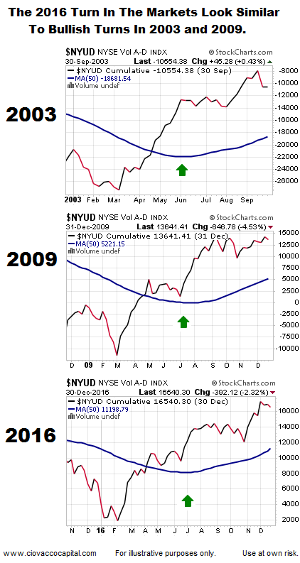
You Can’t Compare 2016 To 2003/2009
It is easy to understand how a major stock market bottom can form after a bear market (2003 and 2009). However, it is more difficult to understand how one could have possibly formed in 2016, given the S&P 500 did not hit the 20% bear-market threshold. While the major indexes held up relatively well in late 2015/early 2016, the story was quite a bit different for the average stock. From a January 11, 2016 USA Today story:
There is mounting evidence that the U.S. stock market is being decimated and undermined by a so-called “stealth” bear market…Indeed, the Standard & Poor’s 1500 index – a broad basket of large, mid and small company stocks – shows that the average stock’s distance from its 52-week high is 26.9%, according to stats compiled by Bespoke Investment Group through Friday’s close. “That’s bear market territory!” says Paul Hickey, co-founder of Bespoke Investment Group, the firm that provided USA TODAY with the gloomy price data.
Does 2016-17 Look More Like A Major Top Or A Major Bottom?
This week’s stock market video uses facts to complete check marks in the table below. If you review the evidence with an open mind, the conclusions may be surprising.
Tech Breaks Long-Term Barrier
The NASDAQ’s long-term chart (1982-2017) also leaves the door open to better than expected outcomes in the coming weeks, months, and years.
Broad Market Has A Constructive Set-Up
The NYSE’s long-term chart below aligns with the volume-based breadth analysis above. The NYSE Composite was unable to clear the orange box below between 1996 and 2015; a break occurred in 2016.
Breadth Aligns With Stocks
The NYSE’s up/down volume indicator has also recently cleared some areas of past resistance. The longer the indicator remains above the orange boxes below, the more meaningful it becomes from a bullish perspective.
Remaining Open To All Outcomes
The facts we have in hand today align with a growth-oriented investment stance. As long as that is the case, our allocations will continue to be heavily tilted toward equity ETFs. If the evidence shifts in a meaningful way, flexibility will allow for prudent adjustments.
Trading in financial instruments and/or cryptocurrencies involves high risks including the risk of losing some, or all, of your investment amount, and may not be suitable for all investors. Prices of cryptocurrencies are extremely volatile and may be affected by external factors such as financial, regulatory or political events. Trading on margin increases the financial risks.
Before deciding to trade in financial instrument or cryptocurrencies you should be fully informed of the risks and costs associated with trading the financial markets, carefully consider your investment objectives, level of experience, and risk appetite, and seek professional advice where needed.
Fusion Media would like to remind you that the data contained in this website is not necessarily real-time nor accurate. The data and prices on the website are not necessarily provided by any market or exchange, but may be provided by market makers, and so prices may not be accurate and may differ from the actual price at any given market, meaning prices are indicative and not appropriate for trading purposes. Fusion Media and any provider of the data contained in this website will not accept liability for any loss or damage as a result of your trading, or your reliance on the information contained within this website.
It is prohibited to use, store, reproduce, display, modify, transmit or distribute the data contained in this website without the explicit prior written permission of Fusion Media and/or the data provider. All intellectual property rights are reserved by the providers and/or the exchange providing the data contained in this website.
Fusion Media may be compensated by the advertisers that appear on the website, based on your interaction with the advertisements or advertisers.