Is There A Signal In Noise? Yield Curves,Growth And Stock Prices!
Aswath Damodaran | Dec 09, 2018 04:04AM ET
The title of this post is not original and draws from Nate Silver's book on why so many predictions in politics, sports and economics fail. It reflects the skepticism with which I view many 'can't fail" predictors of economic growth or stock markets, since they tend to have horrendous track records. Over the last few weeks, as markets have gyrated, market commentators have been hard pressed to explain day-to-day swings, but that has not stopped them from trying. The explanations have shifted and morphed, often in contradictory ways, but few of them have had staying power. On Tuesday (December 4), as the Dow dropped 800 points, following a 300-point up day on Monday, the experts found a new reason for the market drop, in the yield curve, with an "inverted yield curve", or at least a portion of one, predicting an imminent recession. As with all market rules of thumb, there is some basis for the rule, but there are shades of gray that can be seen only by looking at all of the data.
Yield Curves over time
The yield curve is a simple device, plotting yields across bonds with different maturities for a given issuing entity. US treasuries, historically viewed as close to default free, provide the cleanest measure of the yield curve, and the graph below compares the US treasury yield curve at the start of every year from 2009 to 2018, i.e., the post-crisis years:
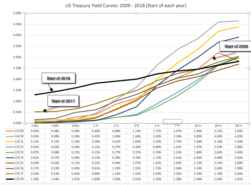
The yield curve has been upward sloping, with yields on longer term maturities higher than yields on short term maturities, every year, but it has flattened out the last two years. On December 4, 2018, the yields on treasuries of different maturities were as follows:
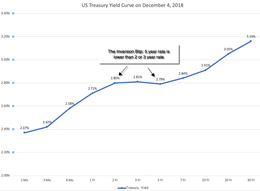
The market freak out is in the highlighted portion, with 5-year rates being lower (by 0.01-0.02%) than 2-year or 3-year rates, creating an inverted portion of the yield curve.
Yield Curves and Economic Growth: Intuition
To understand yield curves, let's start with a simple economic proposition. Embedded in every treasury rate are expectations of expected inflation and expected real real interest rates, and the latter
Interest Rate = Expected Inflation Rate + Expected Real Interest Rate
Over much of the last century, the US treasury yield curve has been upward sloping, and the standard economic rationalization for it is a simple one. In a market where expectations of inflation are similar for the short term and the long term, investors will demand a "maturity premium" (or a higher real interest rate) for buying longer term bonds, thus causing the upward tilt in the yield curve. That said, there have been periods where the yield curve slopes downwards, and to understand why this may have a link with future economic growth, let's focus on the mechanics of yield curve inversions. Almost every single yield curve inversion historically, in the US, has come from the short end of the curve rising significantly, not a big drop in long term rates. Digging deeper, in almost every single instance of this occurring, short term rates have risen because central banks have hit the brakes on money, either in response to higher inflation or an overheated economy. You can see this in the chart below, where the Fed Funds rate (the Fed's primary mechanism for signaling tight or loose money) is graphed with the 3 month, 2 year and 10 year rates:
As you can see in this graph, the rises in short term rates that give rise to each of the inverted yield curve episodes are accompanied by increases in the Fed Funds rate. To the extent that the Fed's monetary policy action (of raising the Fed funds rate) accomplishes its objective of slowing down growth, the yield slope metric becomes a stand-in for the Fed effect on the economy, with a more positive slope associated with easier monetary policy. You may or may not find any of these hypotheses to be convincing, but the proof is in the pudding, and the graph below, excerpted from a recent Fed study, seems to indicate that there has been a Fed effect in the US economy, and that the slope of the yield curve has operated as proxy for that effect:
The track record of the inverted yield curve as a predictor of recessions is impressive, since it has preceded the last eight recessions, with only only one false signal in the mid-sixties. If this graph holds, and December 4 was the opening salvo in a full fledged yield curve invasion, the US economy is headed into rough waters in the next year.
Yield Curves and Economic Growth: The Data
The fact that every inversion in the last few decades has been followed by a recession will strike fear into the hearts of investors, but is it that fool proof a predictor? Perhaps, but given that the yield curve slope metrics and economic growth are continuous, not discrete, variables, a more complete assessment of the yield curve's predictive power for the economy would require that we look at the strength of the link between the slope of the yield curve (and not just whether it is inverted or not) and the level of economic growth (and not just whether it is positive or negative).
To begin this assessment, I looked at the rates on three-month and one-year T.Bills and the two, five and ten-year treasury bonds at the end of every quarter from 1962 through the third quarter of 2018:
Following up, I look at five yield curve metrics (1 year versus 3 month, 2 year versus 3 month, 5 year versus 2 year, 10 year versus 2 year and 10 year versus 3 month), on a quarterly basis from 1962 through 2018, with an updated number for December 4, 2018.
The graph does back up what the earlier Fed study showed, i.e., that negatively sloped yield curves have preceded recessions, but even a cursory glance indicates that the relationship is weak. Not only does there seem to be no relationship between how downwardly sloped the yield curve is and the depth of the recessions that follow, but in periods where the yield curve is flat or mildly positive, subsequent economic growth is unpredictable. To get a little more precision into the analysis, I computed the correlations between the different yield curve slope metrics and GDP growth:
Taking a closer look at the data, here is what I see;
- It is the short end that has predictive power for the economy: Over the entire time period (1962-2018), the slope of the short end of the yield curve is positively related with economic growth, with more upward sloping yield curves connected to higher economic growth in subsequent time periods. The slope at the long end of the yield curve, including the widely used differential between the 10-year and 2-year rate not only is close to uncorrelated with economic growth (the correlation is very mildly negative).
- Even that predictive power is muted: Over the entire time period, even for the most strongly linked metric (which is the 2 year versus 1 year), the correlation is only 29%, for GDP growth over the next year, suggesting that there is significant noise in the prediction.
- And 2008 may have been a structural break: Looking only at the last ten years, the relationship seems to have reversed sign, with flatter yield curves, even at the short end, associated with higher real growth. This may be a hangover from the slow economic growth in the years after the crisis, but it does raise red flags about using this indicator today.
How do you reconcile these findings with both the conventional wisdom that inverted yield curves are negative indicators of future growth and the empirical evidence that almost every inversion is followed by a recession? It is possible that it is the moment of inversion that is significant, perhaps as a sign of the Fed's conviction, and that while the slope of the yield curve itself may not be predictive, that moment that the yield curve inverts remains a strong indicator.
Yield Curves and Stock Returns As investors, your focus is often less on the economy, and more on stock prices. After all, strong economies don't always deliver superior stock returns, and weak ones can often be accompanied by strong market performance. From that perspective, the question becomes what the slope of the yield curve and inverted yield curves tell you about future stock returns, not economic growth. I begin the analysis by looking at yield curve metrics over time, graphed against return on US stocks in the next quarter and the next year:
If you see a pattern here, you are a much better chart reader than I am. I therefore followed up the analysis by replicating the correlation table that I reported in the economic growth section, but looking at stock returns in subsequent periods, rather than real GDP growth:
As with the economic growth numbers, if there is any predictive power in the yield curve slope, it is at the short end of the curve and not the long end. And as with the growth numbers, the post-2008 time period is a clear break from the overall numbers.
What does all of this mean for investors today? I think that we may be making two mistakes. One is to take a blip on a day (the inversion in the 2 and 5 year bonds on December 4) and read too much into it, as we are apt to do when we are confused or scared. It is true that a portion of the yield curve inverted, but if history is any guide, its predictive power for the economy is weak and for the market, even weaker. The other is that we are taking rules of thumb developed in the US in the last century and assuming that they still work in a vastly different economic environment.
Bottom Line
There is information in the stope of the US treasury yield curve, but I think that we need to use it with caution. In my view, the flattening of the yield curve in the last two years has been more good news than bad, an indication that we are coming out of the low growth mindset of the post-2008 crisis years. However, I also think that the stalling of the US 10-year treasury bond rate at 3% or less is sobering, a warning that investors are scaling back growth expectations for both the global and US economies, going into 2019. The key tests for stocks lie in whether they can not only sustain earnings growth, in the face of slower economic growth and without the tailwind of a tax cut (like they did last year), but also in whether they can continue to return cash at the rates that they have for the last few years.
Trading in financial instruments and/or cryptocurrencies involves high risks including the risk of losing some, or all, of your investment amount, and may not be suitable for all investors. Prices of cryptocurrencies are extremely volatile and may be affected by external factors such as financial, regulatory or political events. Trading on margin increases the financial risks.
Before deciding to trade in financial instrument or cryptocurrencies you should be fully informed of the risks and costs associated with trading the financial markets, carefully consider your investment objectives, level of experience, and risk appetite, and seek professional advice where needed.
Fusion Media would like to remind you that the data contained in this website is not necessarily real-time nor accurate. The data and prices on the website are not necessarily provided by any market or exchange, but may be provided by market makers, and so prices may not be accurate and may differ from the actual price at any given market, meaning prices are indicative and not appropriate for trading purposes. Fusion Media and any provider of the data contained in this website will not accept liability for any loss or damage as a result of your trading, or your reliance on the information contained within this website.
It is prohibited to use, store, reproduce, display, modify, transmit or distribute the data contained in this website without the explicit prior written permission of Fusion Media and/or the data provider. All intellectual property rights are reserved by the providers and/or the exchange providing the data contained in this website.
Fusion Media may be compensated by the advertisers that appear on the website, based on your interaction with the advertisements or advertisers.