How Housing Starts Forecasts Got Stuck in a Decade of Pessimism
Kevin Erdmann | May 05, 2025 03:27AM ET
I think the Philadelphia Fed’s survey of housing starts forecasts is an interesting window into the mindset of the 2000s.
In Figure 1, think vertically. In any given quarter, the black line is the number of housing starts. The green line is the number of housing starts the experts had expected there to be when they were asked 6 quarters earlier. The red line is the number of stars the experts expected there to be 6 months in the future.
So, for instance, in the first quarter of 1991, there were about 900,000 starts. Back in the 3rd quarter of 1989, the experts thought that there would be 1.5 million starts in the first quarter of 1991. And, in the first quarter of 1991, the experts thought that they would recover to 1.2 million units by the third quarter of 1992.
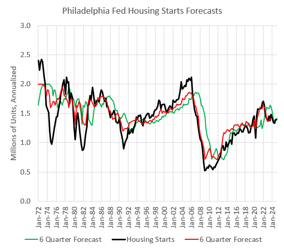
Figure 1
In practice, aggregated forecasts tend to be lagging indicators of the measure they are forecasting. From the forecaster’s perspective, the market acts like a random walk, and as the market changes, forecasts tend to partially reflect the unforeseen change.
There are 3 phases of forecaster behavior here. You can see them more clearly in Figure 2. The black line in Figure 2 tracks forecaster error, quarter by quarter. When it is above zero, actual starts were higher than they had been forecast. The blue line is the accumulated error.
From 1972 to 1994, cyclical changes moved up and down around the less volatile forecasts. On average, they were too optimistic. The business cycle was short during those years - 5 or 6 years from peak to peak. So, forecast errors didn’t stay in one direction for very long. But, while the recessions were short-lived, they were deep.
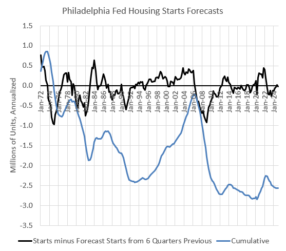
Figure 2
You could say that the Great Moderation broke forecasters’ brains. In Figure 3 (labelled Figure 4 from my Mercatus paper, “Build More Houses”), I compare the relative trends in GDP growth and housing production from 1980 through 2019. Both the rolling average and the standard deviation for housing declined at a similar scale as for GDP growth.
The problem for forecasters was that their forecasting errors started to have more serial correlation. Previously, if they had been too pessimistic, within a few years, the random walk of reality would turn the corner and make their forecast optimistic again.
Figure 3
They were never particularly pessimistic. The forecast errors from 1995 to 2005 weren’t any larger than they had been in the 1970s and 1980s at cycle peaks. The problem was that forecasters were pessimistic for 10 years straight.
This led to 2 peculiar communal reactions. First, by the time the housing contraction came, everybody and his brother had been “calling a bubble” for years. The continued expansion of the market had made all those forecasts seem contrarian when in fact the forecasters were herding into pessimism together.
So, the bust created a sort of confirmation bias that made everyone in the herd feel like outliers who had been proven right. When 2006 rolled around, everyone could hold up their copy of “Irrational Exuberance” and declare that, while the market had been ignorant of this inevitability, we knew it.
Then, during the contraction, there was another weird shift in communal psychology. By 2004 and 2005, forecasters were predicting a drop in starts of 200,000 to 300,000 units (annualized) over the following 6 quarters, compared to current numbers. Suddenly, in 2006, it came true. Their pessimistic forecasts had been accurate.
But, look back at Figure 1. Forecasters generally update to current conditions to a certain extent. So, they might shade down their forecasts for a few quarters as the market declines. But, eventually, they expect cycles to reverse.
You can see by the red and black lines that generally, when a measure falls below the previous forecast, forecasters tend to fall into a pattern of saying, “OK. It fell a little more than we thought. Now, it will bottom here for a while until the next expansion.” That’s what’s happening when the red and black lines are declining together.
After a few quarters of being too optimistic and shading lower with the new numbers, they become more assertive. They start saying, “OK. This is plenty far enough. This is the bottom, and in 6 quarters, starts will be higher than they are now.”
And, on that, they are eventually right, too. That’s when the red line stops dropping. When that happened in earlier cycles, the black line would drop sharply for a couple of quarters and then recover just as sharply.
But, forecasters after 2005 just kept updating to more pessimistic forecasts until 2009, all the way from 1.8 million units to 710,000 units. And, even then, they were too optimistic. Starts didn’t quickly recover after 2009.
So, you might say that they were right to keep becoming more pessimistic.
The odd thing is, they weren’t appropriately pessimistic out of the gate. As you can see in Figure 2, the cumulative overestimate of future starts more than reversed the cumulative underestimate that had built up from 1995 to 2005.
My armchair psychologist description of this is that there was this sense that everyone knew that a contraction was coming. When it came, it served as confirmation bias. And, then, as it kept getting worse, it interacted with that confirmation bias, and the herd thought, “I didn’t have enough confidence in myself. I had been shading myself to be too optimistic. But, this proves that I had been more right about the unsustainable housing bubble than I had let myself admit.”
Since about 2014, forecasters have gone back to the old pattern of projecting a continuation of today’s rate of construction. And since we haven’t had any business cycle recessions or any significant growth, those forecasts have been pretty accurate.
Forecasters haven’t been particularly optimistic or pessimistic.
But, I think this is sort of a case of “two wrongs making a forecast right”. They have been too pessimistic, but the severe limit on mortgage access has kept housing starts in check, preventing housing starts from rising as much as they should have.
Figure 4 shows housing starts per capita. (Here I have also included manufactured homes, which played a larger role in the mid-20th century.)
When the business cycle was short and volatile, pessimistic and optimistic forecasting errors didn’t matter so much. And, serial correlation in the errors didn’t get into our heads as much.
But, the Great Moderation changed that dynamic. With an extended business cycle, the cycle itself isn’t going to cause directional re-assessment. So, with longer, more stable business cycles, it is more important to get your benchmark estimate of cyclically neutral activity correct.
I’m not sure what was making forecasters so bearish in the 1990s. New homes per capita would have been considered recessionary in earlier periods. Every quarter where starts per capita had previously been at a similar level as 2004 and 2005, forecasters predicted growth. Yet, in 2005, they were a decade into predicting decline.
Figure 4
It’s true that demographics were changing in the 70s and 80s, and it might be reasonable to expect a relative decline over time. Starts were relatively lower in 2005 than they had been before the 1990s, on a per capita basis. Why did forecasters expect more than that?
Remember, rent inflation was elevated for that entire period. Figure 5 shows 12-month shelter inflation relative to core non-shelter inflation from 1996 to 2008. Just at the top of the housing boom, when housing starts on a per capita basis were just starting to move into what would have been non-recessionary levels in the 20th century, rent inflation briefly was moderate.
It’s the credit brain worm. Rising prices were generally blamed on loose lending markets, and the demand and supply explanations for rising home prices are on very divergent paths. It’s hard to correct when you find yourself on the wrong path. After seeing 20 years more data, many still find it hard to jump paths.
Part of the evidence down that credit explanation path was that housing starts kept rising in the 2000s because rising prices allowed underwriters to be sloppy. Rising prices made borrowers look better than they were, and so the party rolled on. A natural herding behavior emerges. There is something to that story.
There is also herding behavior on the supply side. I frequently harp on Ed Leamer. He presented a great and very useful paper to the Fed in August 2007 about how housing starts are a leading indicator for recessions. Everything about that paper was great, except he had a very sloppy benchmark.
When the business cycle is more extended and stable, your benchmark is important. He used a constant as his cyclically neutral number of housing starts - 1.5 million units in the 1960s when US population was 190 million and in the 2000s when the US population was 300 million. That was a very poor way to benchmark.
But the herd had been forecasting a decline in housing starts for a decade. Nobody was going to look too hard at his benchmark if it says there are too many houses. That’s what they expected it to say.
Herding on the demand side created a small boom and bust from 2004 to 2007. Then herding on the supply side created a crisis in 2008.
One thing we have going for us today is that the forecasters are back to acting more normal. They are forecasting a continuation of current activity. The expert herd will not feel vindicated by collapse in the near future.
Original Post
Trading in financial instruments and/or cryptocurrencies involves high risks including the risk of losing some, or all, of your investment amount, and may not be suitable for all investors. Prices of cryptocurrencies are extremely volatile and may be affected by external factors such as financial, regulatory or political events. Trading on margin increases the financial risks.
Before deciding to trade in financial instrument or cryptocurrencies you should be fully informed of the risks and costs associated with trading the financial markets, carefully consider your investment objectives, level of experience, and risk appetite, and seek professional advice where needed.
Fusion Media would like to remind you that the data contained in this website is not necessarily real-time nor accurate. The data and prices on the website are not necessarily provided by any market or exchange, but may be provided by market makers, and so prices may not be accurate and may differ from the actual price at any given market, meaning prices are indicative and not appropriate for trading purposes. Fusion Media and any provider of the data contained in this website will not accept liability for any loss or damage as a result of your trading, or your reliance on the information contained within this website.
It is prohibited to use, store, reproduce, display, modify, transmit or distribute the data contained in this website without the explicit prior written permission of Fusion Media and/or the data provider. All intellectual property rights are reserved by the providers and/or the exchange providing the data contained in this website.
Fusion Media may be compensated by the advertisers that appear on the website, based on your interaction with the advertisements or advertisers.