4 Calling Charts
Chad Champion | Dec 23, 2017 03:04PM ET
It’s a good time to look at the big picture as 2017 comes to an end. In other words, what are the indicators telling us?
Today, I’m going to talk about four charts. The bottom line is this… Investors need to be more cautious and more selective in what they buy.
Like I explained a couple of weeks ago, it’s time to sell expensive and buy cheap . Here’s why…
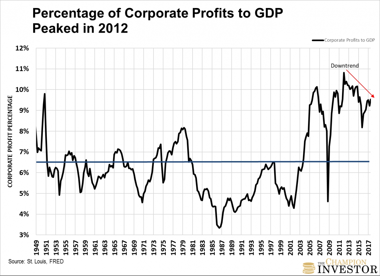
Corporate profits as a percentage of gross domestic product have been declining since 2012. Back then, corporate profits were close to 11% of GDP.
You can see the downtrend here…

As Nobel Prize Winning Economist Milton Friedman said this week in Fortune Magazine,
“When earnings are exceptionally high, they don’t just keep booming… Profits must move back down to their traditional share of GDP. They can’t break loose from economic gravity.”
Profits today are 9.5% of GDP. The blue line above is the historical average of corporate profits to GDP since 1949. It’s 6.5%.
They have been “loose from economic gravity” for several years. So far, they’ve declined 12% (as a percentage of GDP) from their peak.
Yet, as you’ll see in the next chart, stock values continue making record highs. Corporate profits and stock values can’t go in opposite directions for too long. It’s a signal that a correction in the stock market looms.
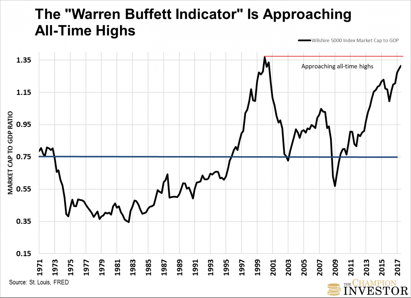
This second chart I’m referring to is known as the “Warren Buffett Indicator.” It’s near all-time highs. He says, “It is probably the best single measure of where valuations stand at any given moment."
This indicator measures total stock market capitalization as a percentage of GDP. A common way to measure it is by using the Wilshire 5000 Full Cap Market Index as a proxy for stock market cap.

The blue line is the historical average since 1971. It’s 75%. Today, the stock market cap to GDP is 131%. Even if you use the high point in 2007 before the global financial crisis as “normal”, the ratio would need to correct by 20%.
As you can see from both charts, profits and stock values as a percentage of GDP are going in opposite directions. Yet based on the final two charts, no one seems to be worrying about it.
The St. Louis Federal Reserve measures the degree of financial stress in the markets using an indicator called the St. Louis Fed Financial Stress Index. It’s a mix of 18 different weekly data series.
As you can see below, the index is at an all-time low since its inception.
Zero (the blue line) means “normal financial market conditions.” Above zero is above-average financial market stress. Below zero is below-average financial market stress. Which is what it is telling us today.
Even though profits and stock values are going in opposite directions.
The TED Spread is telling us banks aren’t worried either…
The TED Spread is the difference between the 3-month LIBOR rate and the 3-month Treasury Bill rate. It’s generally used to measure economic risk. Most would consider the U.S. 3-month Treasuries the safest assets on the market. Which is why it’s used for the spread.
The larger the spread between the two, the larger the economic risk in the economy. It generally means banks think there’s a chance that some banks could default. So, banks charge a higher rate to borrowers because of the higher risk.
You can see it spiked when the market crashed in 1987, during the dot-com bust and the financial crisis. Right now, it’s telling us economic risk is low. Again, even though corporate profits and stock market values are diverging.
Look, no one can’t predict what’s going to happen next. Stocks could run a lot higher from here. But it’s time to think about the risk versus the reward. Like I explained earlier, the bottom line is that it’s time for investors to be more cautious and more selective in what they buy.
Remember, the price you pay for an asset is the single biggest driver of future returns. Sell what’s expensive, buy what’s cheap.
Trading in financial instruments and/or cryptocurrencies involves high risks including the risk of losing some, or all, of your investment amount, and may not be suitable for all investors. Prices of cryptocurrencies are extremely volatile and may be affected by external factors such as financial, regulatory or political events. Trading on margin increases the financial risks.
Before deciding to trade in financial instrument or cryptocurrencies you should be fully informed of the risks and costs associated with trading the financial markets, carefully consider your investment objectives, level of experience, and risk appetite, and seek professional advice where needed.
Fusion Media would like to remind you that the data contained in this website is not necessarily real-time nor accurate. The data and prices on the website are not necessarily provided by any market or exchange, but may be provided by market makers, and so prices may not be accurate and may differ from the actual price at any given market, meaning prices are indicative and not appropriate for trading purposes. Fusion Media and any provider of the data contained in this website will not accept liability for any loss or damage as a result of your trading, or your reliance on the information contained within this website.
It is prohibited to use, store, reproduce, display, modify, transmit or distribute the data contained in this website without the explicit prior written permission of Fusion Media and/or the data provider. All intellectual property rights are reserved by the providers and/or the exchange providing the data contained in this website.
Fusion Media may be compensated by the advertisers that appear on the website, based on your interaction with the advertisements or advertisers.