Chart Of The Week: S&P 500 Vertiginous Valuations
Callum Thomas | Mar 30, 2022 12:47AM ET
Valuation Cohorts — The Upper Reaches of Expensiveness: This chart presents the price-to-book ratio picture across the industries/sub-industries that comprise the S&P 500. As you can see, the Upper Quartile of industries are trading at price-to-book ratios *higher* than that seen during the dot com bubble, and this is despite a (minor) reset. Even the Lower Quartile is at the upper end of the range, and last but not least: the Median is well above that ever seen in recent history.
This has left a yawning relative value gap between the cheaper end of the market vs the more expensive end of the market (aka value vs growth). It’s valuation charts like this that really show what’s at stake if we end up in a situation of runaway inflation, a rapid tightening of financial conditions/monetary policy, and potential subsequent economic slowdown .
Sooner or later the excesses on display in this chart will need to be resolved one way or another. This is one reason why value vs growth is an attractive proposition from a relative standpoint, but as always we should note that value stocks could end up outperforming growth stocks simply by losing less vs the more expensive parts of the market…
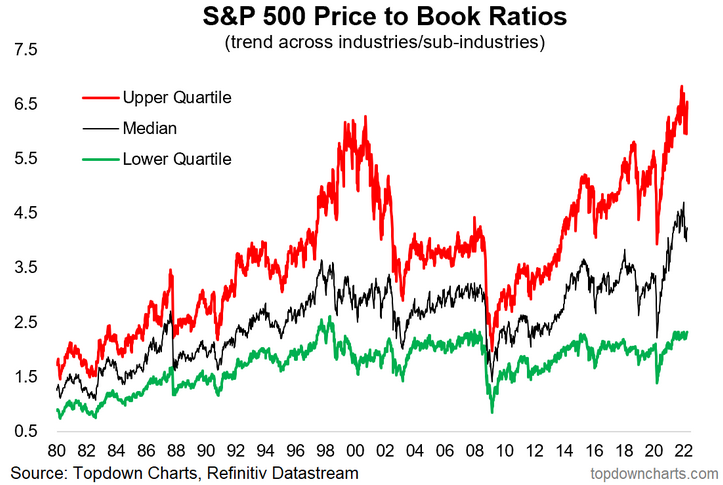
Key point: The most expensive part of the market is more expensive than usual.
![]()
Trading in financial instruments and/or cryptocurrencies involves high risks including the risk of losing some, or all, of your investment amount, and may not be suitable for all investors. Prices of cryptocurrencies are extremely volatile and may be affected by external factors such as financial, regulatory or political events. Trading on margin increases the financial risks.
Before deciding to trade in financial instrument or cryptocurrencies you should be fully informed of the risks and costs associated with trading the financial markets, carefully consider your investment objectives, level of experience, and risk appetite, and seek professional advice where needed.
Fusion Media would like to remind you that the data contained in this website is not necessarily real-time nor accurate. The data and prices on the website are not necessarily provided by any market or exchange, but may be provided by market makers, and so prices may not be accurate and may differ from the actual price at any given market, meaning prices are indicative and not appropriate for trading purposes. Fusion Media and any provider of the data contained in this website will not accept liability for any loss or damage as a result of your trading, or your reliance on the information contained within this website.
It is prohibited to use, store, reproduce, display, modify, transmit or distribute the data contained in this website without the explicit prior written permission of Fusion Media and/or the data provider. All intellectual property rights are reserved by the providers and/or the exchange providing the data contained in this website.
Fusion Media may be compensated by the advertisers that appear on the website, based on your interaction with the advertisements or advertisers.