Chart Of The Week: Backlogs And Bond Yields
Callum Thomas | Jan 12, 2022 12:10AM ET
Back on Backlogs… and Bond-Yield Back-Ups: In this chart we map the path of the global backlogs indicator and the US 10-year Treasury yield. I think it’s fair to say that there are a number of good reasons why this yawning gap opened up (e.g. the initial pandemic shock to activity, demand for safe assets in the early stages of the crisis, and the massive global monetary response— i.e. QE, QE, QE, and more QE (and rate cuts + silly forward guidance).
There’s also a number of good reasons why the relationship shown in the chart below has been fairly reliable in the past (in that backlogs reflect the ebb and flow of demand, ultimately impact inflation, and also reflect and influence the path of monetary policy).
Now that QE is wrapping up around the world (many central banks have already ceased their asset purchase programs, and the Fed is tapering), and inflation/growth have come back, perhaps we see bond yields recoupling to backlogs?
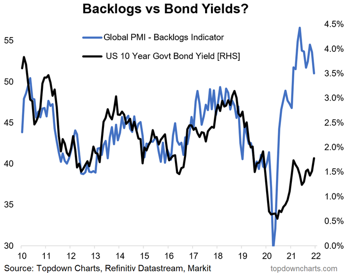
Key point: Backlogs point to bond-yield back-up risk.
![]()
Trading in financial instruments and/or cryptocurrencies involves high risks including the risk of losing some, or all, of your investment amount, and may not be suitable for all investors. Prices of cryptocurrencies are extremely volatile and may be affected by external factors such as financial, regulatory or political events. Trading on margin increases the financial risks.
Before deciding to trade in financial instrument or cryptocurrencies you should be fully informed of the risks and costs associated with trading the financial markets, carefully consider your investment objectives, level of experience, and risk appetite, and seek professional advice where needed.
Fusion Media would like to remind you that the data contained in this website is not necessarily real-time nor accurate. The data and prices on the website are not necessarily provided by any market or exchange, but may be provided by market makers, and so prices may not be accurate and may differ from the actual price at any given market, meaning prices are indicative and not appropriate for trading purposes. Fusion Media and any provider of the data contained in this website will not accept liability for any loss or damage as a result of your trading, or your reliance on the information contained within this website.
It is prohibited to use, store, reproduce, display, modify, transmit or distribute the data contained in this website without the explicit prior written permission of Fusion Media and/or the data provider. All intellectual property rights are reserved by the providers and/or the exchange providing the data contained in this website.
Fusion Media may be compensated by the advertisers that appear on the website, based on your interaction with the advertisements or advertisers.