Chart Of The Day: The S&P 500 Selloff Isn't Over Yet
Investing.com | Mar 11, 2020 10:52AM ET
Supply and demand are rarely at equilibrium with the inherent fair value of an asset. The dynamics tend to overshoot what something should be worth until they reach an extreme, like a swinging pendulum that then gets pulled back to do the same in the opposite direction.
That's the condition of the S&P 500 Index right now, which makes it difficult to predict what may come next. However, when fundamentals are opaque, technical analysis can often add more clarity. The chart below helps illustrate the patterns that are forming — and these suggest that the current selloff isn't quite over yet.
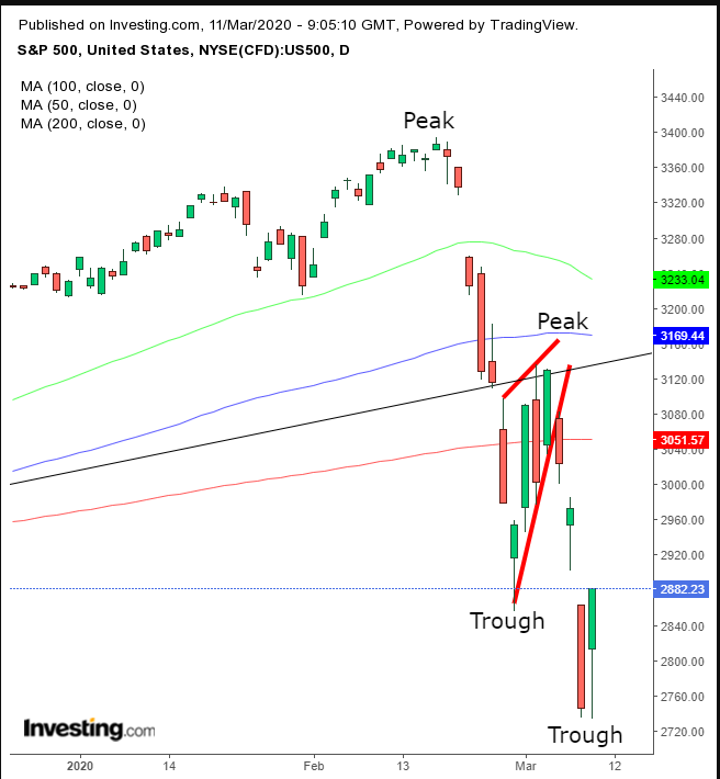
The balance of powers formed a rising flag, bearish after the preceding plunge, which we forecast would complete and extend the selloff.
We expect U.S. President Donald Trump’s fiscal package — aimed at limiting the impact of the coronavirus outbreak — if and when specifics are revealed, to provide the steam for a return move that would retest the rising flag, bearish following the preceding plummet.
If the pattern continues to play out its positional shifting, it may rally to retest the bearish pattern. It’s difficult to say how far such an advance would follow through, as anything can happen to shape the currently skittish, collective sentiment of investors.
We don’t expect such a return move would go past the 200 DMA, which was also the point of the downside breakout at the 3,050 level. But when the market is this volatile, it's not an exact science.
However, the broken uptrend line, the top of the pennant, below 3,200 should be the resistance of last resort, if this decline were to endure.
The technicals following extremely oversold conditions demonstrate that investors are ripe for a buying dip. But we expect it to be a corrective move within the downtrend that was established when the current bottom formed a second trough, completing a descending series of peaks and troughs.
Trading Strategies
Conservative traders would wait before entering a short for a full return move, till at least the 200 DMA and the point of downside breakout at the 3,050 level. They would then wait for evidence of secondary distribution, with at least one long, red candle closing lower than the preceding up day.
Moderate traders are likely to wait for the same corrective rally, but not wait for proof of trend. They would short when the price reached a resistance, with a stop-loss that fits their budget and trading style.
Aggressive traders may risk a contrarian, long position, counting on both fundamentals and technicals to fuel a likely return move on dip buying, and short covering on profit taking.
Trade Sample - Contrarian Long Position
- Entry: 2,800
- Stop-Loss: 2,750
- Risk: 50 points
- Target: 3,000
- Reward: 200 points
- Risk:Reward Ratio: 1:4
Trading in financial instruments and/or cryptocurrencies involves high risks including the risk of losing some, or all, of your investment amount, and may not be suitable for all investors. Prices of cryptocurrencies are extremely volatile and may be affected by external factors such as financial, regulatory or political events. Trading on margin increases the financial risks.
Before deciding to trade in financial instrument or cryptocurrencies you should be fully informed of the risks and costs associated with trading the financial markets, carefully consider your investment objectives, level of experience, and risk appetite, and seek professional advice where needed.
Fusion Media would like to remind you that the data contained in this website is not necessarily real-time nor accurate. The data and prices on the website are not necessarily provided by any market or exchange, but may be provided by market makers, and so prices may not be accurate and may differ from the actual price at any given market, meaning prices are indicative and not appropriate for trading purposes. Fusion Media and any provider of the data contained in this website will not accept liability for any loss or damage as a result of your trading, or your reliance on the information contained within this website.
It is prohibited to use, store, reproduce, display, modify, transmit or distribute the data contained in this website without the explicit prior written permission of Fusion Media and/or the data provider. All intellectual property rights are reserved by the providers and/or the exchange providing the data contained in this website.
Fusion Media may be compensated by the advertisers that appear on the website, based on your interaction with the advertisements or advertisers.