6 Charts That Help Illuminate Key Market Developments In 2020
Callum Thomas | Jan 20, 2021 12:50AM ET
Last week I shared some of the key charts I'm watching for 2021. So this week I wanted to share with you some of my favorite charts of 2020.
This is an excerpt from my 2020 End of Year . The charts made the list either because they were something completely new or just super interesting (to me at least!) ...or indeed ones that helped illuminate some of the key developments across macro and markets.
As a note on formatting, I have included a quote and the date from the original report in which the charts appeared (to help provide some context for why the chart originally appeared, and my thoughts at the time).
Hope you enjoy!
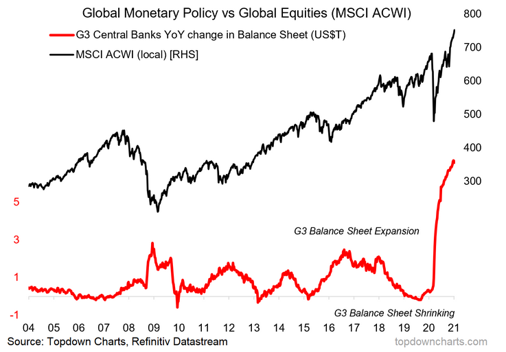
1. Central Bank Balance Sheets: This one was helpful in laying bare the clear pivot in global QE (albeit this only shows the big 3 i.e. Fed, BOJ, ECB, while this year saw dozens of other central banks starting their own programs). It also laid down a clear linkage to equities, and thus a key fundamental reason to be bullish.
“Aside from interest rates, balance sheets are likely to come into focus as those at and near the ZLB figure out the rock and the hard place of NIRP vs more APPs. The Fed already has QE lite, and could do a twist and/or cease MBS runoff to help push mortgage rates down (a more direct transmission to the consumer). Already the policy pivot last year saw a reversal of the brief contraction in balance sheets,” (6 March 2020)
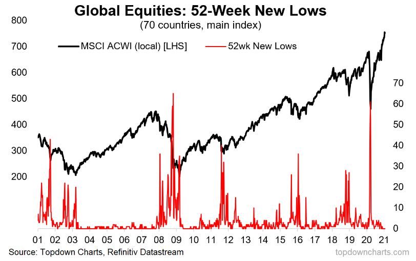
2. Global Equities Country Breadth: This was one of those “wow charts”, it was just plain interesting due to the extreme movement in the indicator. But also extremely useful in helping fill out the bullish case for global equities.
“The number of countries making new 52 week lows at 58 (70 countries covered) is only matched by the depths of the GFC” (13 March 2020)
3. Money Market Fund AUM (aka dry powder): This pair of charts showing basically cash holdings (AUM in money market funds) was really interesting, especially when considered alongside the massive spike in personal savings rates across the globe as people in lockdown stopped spending and either at least kept receiving their pay check or got topped up by the various fiscal policy “economic life support” measures. At the time it led me to quip the term “quarantined cash”, and I think this will be an important background feature as we head into the recovery as a source of fuel for a resurgence in consumer spending… “roaring 20’s” anyone?
“Cash allocations have shot up to near decade highs, and money market funds have made new record highs in AUM… Looks to me like there is a fair amount of dry powder both in portfolios and consumer bank accounts.” (8 May 2020)
4. Small Caps—Market Cap Weighting: An intriguing chart, this one shows the market cap weighting of the S&P 600 small cap index as a proportion of the S&P 1500 (total market). At the low point it got to a 42-year low. This turned out to be a good contrarian buying signal (which lined up with a few other things like (relative) valuations, flows, and implied allocations).
“also worth highlighting is the drop in allocations, and the market cap weighting of small caps falling to a 20 year low I would consider these basically as contrarian indicators, and possible signs of a cyclical bottom” (10 Apr 2020)
5. Commodities ex-Gold: I like this one because it’s a bit non-obvious. Many people lump gold in with commodities, and indeed, the term commodities itself can end up oversimplifying an incredibly broad and diverse set of markets. The point of this chart is to differentiate between gold and commodities ex-gold. As it turned out with the rally in gold and collapse in commodities, there ended up being an attractive relative value opportunity as gold left the rest of commodities behind. Not so much now...
“the equal weighted commodities ex-gold index has reached a new relative low against gold - which is a similar patten to what we saw during previous major market bottoms for commodities” (10 Apr 2020)
6. US Value vs Growth (an important distinction): Last but not least is a key division within US value stocks that I believe yields very interesting clues as to the outlook for value vs growth.
“The other side of value vs growth is what you might call “Defensive Value” i e Healthcare, Consumer Staples, and Utilities. Indeed, if you look at the relative performance of this group vs the S&P 500 it certainly has a defensive look to it, and has tended to be a lot more stable against what we might call “Cyclical Value” i e Energy & Financials. Indeed, looking at the relative performance of Cyclical Value vs Defensive Value we can see that it’s been Cyclical Value driving much of the underperformance of overall Value vs Growth” (13 Nov 2020)
Trading in financial instruments and/or cryptocurrencies involves high risks including the risk of losing some, or all, of your investment amount, and may not be suitable for all investors. Prices of cryptocurrencies are extremely volatile and may be affected by external factors such as financial, regulatory or political events. Trading on margin increases the financial risks.
Before deciding to trade in financial instrument or cryptocurrencies you should be fully informed of the risks and costs associated with trading the financial markets, carefully consider your investment objectives, level of experience, and risk appetite, and seek professional advice where needed.
Fusion Media would like to remind you that the data contained in this website is not necessarily real-time nor accurate. The data and prices on the website are not necessarily provided by any market or exchange, but may be provided by market makers, and so prices may not be accurate and may differ from the actual price at any given market, meaning prices are indicative and not appropriate for trading purposes. Fusion Media and any provider of the data contained in this website will not accept liability for any loss or damage as a result of your trading, or your reliance on the information contained within this website.
It is prohibited to use, store, reproduce, display, modify, transmit or distribute the data contained in this website without the explicit prior written permission of Fusion Media and/or the data provider. All intellectual property rights are reserved by the providers and/or the exchange providing the data contained in this website.
Fusion Media may be compensated by the advertisers that appear on the website, based on your interaction with the advertisements or advertisers.