6 Charts Highlighting Key Market Developments In 2021
Callum Thomas | Dec 30, 2021 12:45AM ET
Last week I shared with you some of my Best Charts of 2021 (as well as my Worst Charts of 2021)—so this week I wanted to follow up with my Favorite Charts of 2021!
The following charts made the list either because they were something completely new or just super interesting (to me at least!)...or indeed ones that helped illuminate some of the key developments across macro and markets.
n.b. I have updated the charts with the latest data (in a few cases the original idea has actually come entirely full-circle). Also on formatting: the italic text is a quote from the report in which the chart originally appeared.
Hope you enjoy!
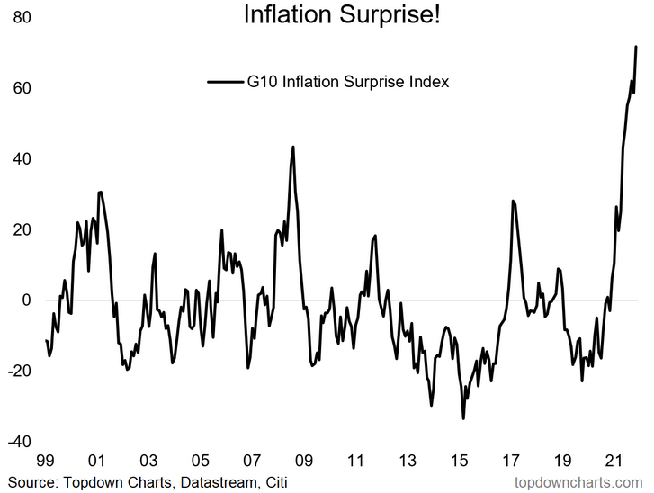
1. Inflation Surprise! This was my go-to chart in highlighting the risks presented by inflation (as I figured that with folk’s inflation expectations skewed downwards by a decade of deflationary winds that my upside inflation scenario would be a big surprise).
“Already we’ve seen inflation surprises go from downside surprises to upside surprises across developed economies, and I’d expect that trend to continue.” (15 Jan 2021)
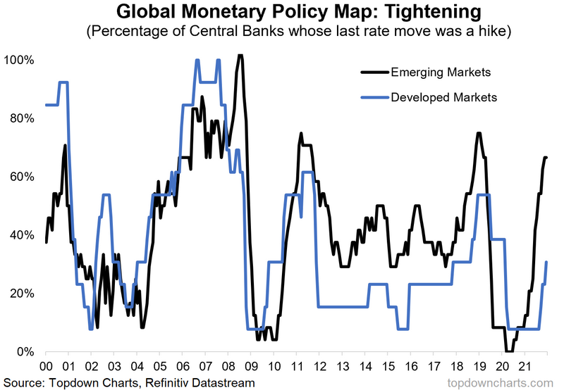
2. Global Monetary Policy Map: If the first chart in this report didn’t make it obvious enough, this next chart should: central banks are stepping away from stimulus, OK?
“With the lift-off in emerging markets (and the small/developing central banks), the global weighted average policy rate has clearly turned the corner. As such I would double down on the call I made earlier in the year for central banks globally to move to a more neutral stance – and actually, would probably be about time to shift the global policy outlook to hawkish.” (7 May 2021)
3. Global Oil & Gas Capex: The next chart shows in the blue line the fall and fall of global Oil & Gas capex: a key reason I stuck with the bullish bias for commodities and crude oil in particular… and a key reason to stay that way. As I note, the path to carbon zero will be paved with a commodities bull market as a logical consequence of the shifts in supply and demand, and investment required to make that shift.
“the medium-term outlook for crude oil: I think it’s worth highlighting again the capex picture for crude – global capex (and rig counts) remain near record lows. Clearly the pandemic has taken a toll on the sector. But the road to carbon zero is going to be a long one and the world won’t kick its petroleum habit overnight, and before we know it the world will be vaccinated, open for business, and potentially overstimulated.” (5 Feb 2021)
4. Euro Stoxx 50 Breakout: This next one makes the favorites list for a few reasons, first is just how text-book a breakout it is, second how significant it is—i.e. with regards to price breaking out from such an entrenched trading range, and how it also helped confirm my biases to expect a breakout in European equities!
“the first shows European equities basically stuck in a range and currently looks to be in the process of making another attempt at breaking out. Given the duration and durability of this trading range, I would say that when/if it does breakout, it will be very significant indeed.” (5 Feb 2021)
5. Bond Yield Model: This chart was actually introduced later in the year but it basically was designed to present a single image— combining half a dozen different charts and indicators which were pointing to higher bond yields. As it stands, there is still quite the disconnect, and therefore upside risk to bond yields (even if they ‘meet in the middle’).
“Moving onto the macro/market indicators, we still see global consumer discretionaries vs staples + developed market manufacturing PMIs + inflation swaps all in agreement that 10-year Treasuries should be (a lot) higher. Thus, risks are clearly skewed to the upside for bond yields.” (22 Jan 2021)
6. Total Population Growth: The last one in this section is a key element [high and stable population growth vs low and falling growth elsewhere] of the strategic case for the often-forgotten Frontier Market Equities. Most allocators put FM equities in the too hard basket, but I have been advocating the surprisingly intriguing strategic case (in many ways superior to EM equities), but also the tactical case—basically nailed the exceptional run in Frontier Market equities over the past year.
“Frontier Market equities have some interesting strategic characteristics: lower historical volatility vs EM, higher expected returns, relatively lower correlations to DM/US equities, and higher expected population growth. Although it is a relatively unpopular corner of global equities, it has begun to attract some attention as price has picked up.” (5 Feb 2021)
These charts were featured in our . Thanks for reading!
Trading in financial instruments and/or cryptocurrencies involves high risks including the risk of losing some, or all, of your investment amount, and may not be suitable for all investors. Prices of cryptocurrencies are extremely volatile and may be affected by external factors such as financial, regulatory or political events. Trading on margin increases the financial risks.
Before deciding to trade in financial instrument or cryptocurrencies you should be fully informed of the risks and costs associated with trading the financial markets, carefully consider your investment objectives, level of experience, and risk appetite, and seek professional advice where needed.
Fusion Media would like to remind you that the data contained in this website is not necessarily real-time nor accurate. The data and prices on the website are not necessarily provided by any market or exchange, but may be provided by market makers, and so prices may not be accurate and may differ from the actual price at any given market, meaning prices are indicative and not appropriate for trading purposes. Fusion Media and any provider of the data contained in this website will not accept liability for any loss or damage as a result of your trading, or your reliance on the information contained within this website.
It is prohibited to use, store, reproduce, display, modify, transmit or distribute the data contained in this website without the explicit prior written permission of Fusion Media and/or the data provider. All intellectual property rights are reserved by the providers and/or the exchange providing the data contained in this website.
Fusion Media may be compensated by the advertisers that appear on the website, based on your interaction with the advertisements or advertisers.