
We have a big week ahead for news and economic data. As I have noted in recent updates, economic fundamentals have had little bearing on stock price movement. In fact, the opposite has been the case. Whatever happens with stock and bond prices is selectively used to spin the data interpretation. That was a challenge this week since the economic reports were very good.
For now, it appears that Santa is off course or else planning to deliver a lump of coal. But maybe, just maybe, there will be a year-end shift in sentiment. If so, we can expect the punditry to make a quick shift to asking:
What might go right?
You would not realize it from reading your daily news, blogs, or watching TV, but mainstream thought remains quite positive on the economy and stocks.
Last Week Recap
In my last edition of WTWA I took note of the dire news and recession warnings. For investors focused on fundamentals, I suggested there might be a chance for some holiday shopping. After an early-week bounce, that proved to be correct.
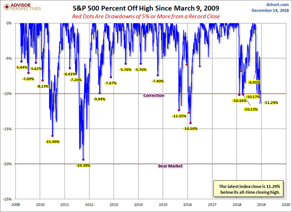
The Story in One Chart
I always start my personal review of the week by looking at a great chart. This week I am featuring Jill Mislinski.
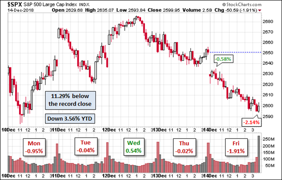
The market declined 1.3% for the week, but it probably felt worse to most observers. The sharp selling after Tuesday’s strong opening created a lot of buzz. The end-of-week decline felt even worse. The trading range was 3.9%, lower than recent levels but still elevated. Readings on actual and expected volatility are included in our Indicator Snapshot.
The sentiment is partly driven by the drawdowns, of course, which are not exceptional by historical standards. Something not reflected is that the average stock is down more than the index. Large caps and bond-equivalent sectors have held up better than the average stock, and a lot better than those with trade or economic sensitivity.
The News
Each week I break down events into good and bad. For our purposes, “good” has two components. The news must be market friendly and better than expectations. I avoid using my personal preferences in evaluating news – and you should, too!
New Deal Democrat’s high frequency indicators are an important part of our regular research. This week’s update shows that the long-leading indicators have improved to neutral while other time fames remain positive. Read the full post to get a better sense of the range of indicators and more color on the interpretation.
When relevant, I include expectations (E) and the prior reading (P).
The Good
- Wholesale inflation via PPI registered 0.1%. E 0.0% P 0.6%.
- CPI showed no increase on the headline and the expected 0.2% on the core.
- Initial jobless claims dipped to 206K. E 228K P 231k. This broke a string of somewhat higher readings, although the series remains in record territory.
- Industrial production grew 0.6% in November. E 0.2% P -0.2% revised down from +0.1%. The November strength is partly a reflection of the revision in the prior month.
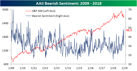
- Investor sentiment (a contrarian indicator) is the most bearish in the last five years. (Bespoke)
The Bad
- Retail Sales gained only 0.2% E 0.2% P 1.1% revised up from 0.8%. Most viewed this report as OK. A flat number is not unusual when the prior month is revised higher. Eddy Elfenbein explains.
- The chemical activity barometer is still increasing, but only 2.8% on a three-month moving average and a 0.8% decline in November. (Steven Hansen, Econintersect).
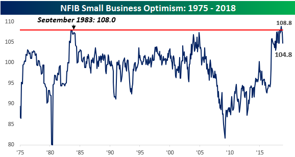
- NFIB Small Business Optimism Index remained very high at 104.8, but missed expectations of 107. P 107.4. This year is going to beat 2017 for the best record in the history of the survey. The biggest complaint? Difficulty in finding qualified labor. Bespoke describes this as a “meaningful pullback” after three straight monthly declines. David Templeton (HORAN) analyzes the reasons behind this move.
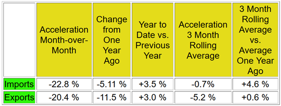
- Sea container traffic declined significantly in LA and Long Beach. Steven Hansen (Econintersect), as we expect him to, looks at the data from a variety of interesting perspectives. Because it is a noisy series, he prefers 3-month rolling averages. He concludes that “it was a terrible month…This is the first dataset I have seen which could be a self-inflicted wound from the trade wars.”
The Ugly
In the spirit of the holiday season, let’s take a break from the ugly. Mrs. OldProf and I wish a Happy Holidays to all (even Bear fans once tomorrow’s game is over).
Noteworthy
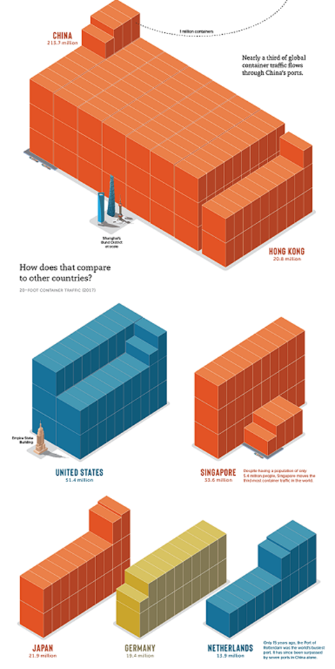
To emphasize the importance of shipping and the contributions of different countries, go to Nick Routley’s post at Visual Capitalist. There is some interesting history about how containers revolutionized trading and conferred economic benefits on particular countries. The visual is very large, so I am including only a portion here. Be sure to check out the full infographic. I am including enough to show the US versus China, and the rise of China compared to Rotterdam, the world’s busiest port only fifteen years ago.
The Week Ahead
We would all like to know the direction of the market in advance. Good luck with that! Second best is planning what to look for and how to react.
The Calendar
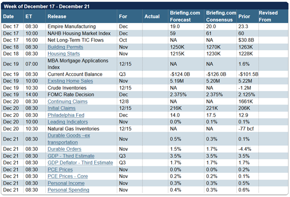
The calendar includes many important reports – housing, personal income and spending, and leading indicators. The FOMC rate decision will be a focal point. While another hike is anticipated, the accompany press conference and statement will be closely watched for signs of future plans.
Briefing.com has a good U.S. economic calendar for the week. Here are the main U.S. releases.
Next Week’s Theme
This week’s issue of Barron’s includes 2019 market forecasts from a panel of ten prominent representatives of big investment banks and asset managers. I don’t care for these specific forecasts. They should come with a track record and a margin of error band! I also do not like the calendar orientation. The forecast is made at the start of the year, and then perhaps revised later – but still with year-end in mind.
I prefer to think about one year ahead, a rolling period adjusting as evidence changes. You need no more than a general idea of market conditions and direction – not a specific forecast.
So why pay any attention at all? The process of creating a forecast requires the analyst to think more deeply. The result is competing scenarios with different implications for sector weighting and allocation adjustment. Since the entire group is positive on the outlook for the coming year, it is reasonable to ask why.
While it might not be obvious, some are actually thinking ahead, asking:
What might go right?
I will mention some of the scenarios they see, and then add a few more ideas in the final thought. Without endorsing a specific person, target, or idea, here are some of the scenario elements.
- Solid S&P earnings growth. The group sees $170 – 178 for the S&P 500. Only 5-6% growth with no added tax reduction stimulus. (This is actually less than the first-rate analysis of bottoms-up estimates (9-10%) from Brian Gilmartin).
- Progress on the China trade front in early 2019.
- Attractive valuations, after the recent selling.
- Moderation in Fed rate increases – maybe one or two.
- Limited downside risk.
Ed Yardeni notes that “You had a bear market in the P/E multiple, but a bull market in earnings.” This is another way of describing emotion in place of analysis.
The entire article is interesting if you read it in the way I am recommending. I have also not mentioned the sectors to favor and to avoid recommended by each participant.
The biggest threats?
- A breakdown in trade talks.
- A more aggressive Fed.
- An “earnings recession.”
- Sentiment reducing the P/E multiple.
Please remember that these are mainstream managers who can make money for investors in any type of market. Like me, they have products that emphasize bonds or specific market protection. They attract clients with good information, not a bullish bias.
I have some ideas of my own in today’s Final Thought.
Quant Corner
We follow some regular featured sources and the best other quant news from the week.
Risk Analysis
I have a rule for my investment clients. Think first about your risk. Only then should you consider possible rewards. I monitor many quantitative reports and highlight the best methods in this weekly update.
The Indicator Snapshot
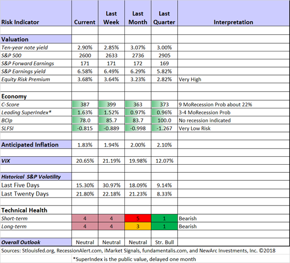
Short-term trading conditions remain unfavorable. This is mostly a reflection of volatility, not a prediction of market direction. There is always a risk/reward balance to consider in your trading. When conditions are technically challenged, we watch trading positions even more closely. Each of our models has a specific exit strategy. The technical health rating may drop enough for a complete trading exit. It got close to that level recently.
Long-term trading has retreated slightly from the highest risk level. Those who emphasize technical analysis have emphasized the “damage” done to charts by the sustained correction. Our methods show that a clean bill of technical health will require some time.
Fundamental analysis remains strongly bullish. Earnings are great, prices are lower, and there is even less competition from bonds. We reduce fundamental positions (as we did in 2011) when we get a warning from the recession or financial stress indicators, not merely as a reaction to technical signals. This leads me to a “neutral” overall outlook.
The Featured Sources:
Bob Dieli: Business cycle analysis via the “C Score.
Brian Gilmartin: All things earnings, for the overall market as well as many individual companies.
RecessionAlert: Strong quantitative indicators for both economic and market analysis.
Georg Vrba: Business cycle indicator and market timing tools. None of Georg’s indicators signal recession. Here is the latest update on his BCI indicator.
Doug Short and Jill Mislinski: Regular updating of an array of indicators. Great charts and analysis.
Guest Commentary
Rob Marstrand has an interesting idea which deserves a closer look. He suggests that U.S. stocks look cheap, even on measures like the CAPE ratio, if you simply remove Amazon (NASDAQ:AMZN). He sees the CAPE ratio as giving a “very false reading” at the moment. He writes:
I’ve looked at Amazon’s EPS for the past 10 years and worked out a CAPE ratio (adjusting each year’s EPS for inflation and taking the average). Since Amazon made no money to speak of until very recently, the CAPE comes to a massive 458.
Backing out Amazon from the index brings the CAPE of everything else right down to 16.9, a drop of 43%.
Put another way, imagine if Amazon went bust tomorrow and the stock went to zero. An S&P 500 index investor would lose less than 3% of their investment, but the CAPE would plummet by 43% overnight.
And even if you keep Amazon in the index, the WSJ observes that we are at five-year lows in global stock valuations.
Menzie Chinn – 10/2 inversion likely. During the expansion this has meant a lead time (after the inversion) of 19, 13, and 22 months. He also notes recent research on the effect of a low term premium on the shape of the curve.
Mark Rzepczynski focuses on the relationship with equity prices. A key takeaway is that the period between inversion and recession is (on average) 17 months. Stocks have generally been positive during this interval.
Insight for Traders
Check out our weekly “Stock Exchange”. We combine links to important posts about trading, themes of current interest, and ideas from our trading models. This week we looked at alternative trading strategies for a wild market. As usual, we discussed some recent picks from our trading models and highlighted advice from trading experts. Our ringleader and editor, Blue Harbinger, provided fundamental counterpoint for the models, all of which are technically-based. The models have a much different approach to volatile markets than that which I recommend for investors.
Insight for Investors
Investors should have a long-term horizon. They can often exploit trading volatility.
Best of the week
If I had to pick a single article for investors, it would be Prof. Aswath Damodaran’s analysis of the yield curve’s predictive power. Some will find this to be challenging reading, but it is quite well-organized and clearly-explained. If you are frightened by the newly-minted yield curve experts with exaggerated recession odds, this article is a must read. Here is a key chart followed by Dr. Damodaran’s summary.
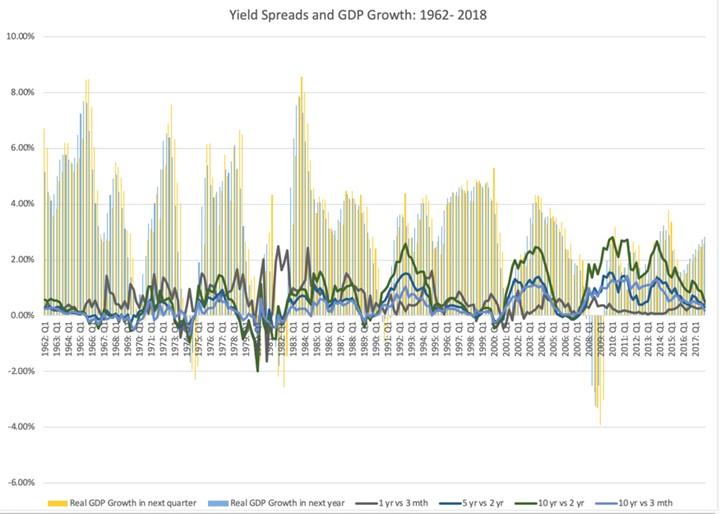
Taking a closer look at the data, here is what I see;
It is the short end that has predictive power for the economy: Over the entire time period (1962-2018), the slope of the short end of the yield curve is positively related with economic growth, with more upward sloping yield curves connected to higher economic growth in subsequent time periods. The slope at the long end of the yield curve, including the widely used differential between the 10-year and 2-year rate not only is close to uncorrelated with economic growth (the correlation is very mildly negative).
Even that predictive power is muted: Over the entire time period, even for the most strongly linked metric (which is the 2 year versus 1 year), the correlation is only 29%, for GDP growth over the next year, suggesting that there is significant noise in the prediction.
And 2008 may have been a structural break: Looking only at the last ten years, the relationship seems to have reversed sign, with flatter yield curves, even at the short end, associated with higher real growth. This may be a hangover from the slow economic growth in the years after the crisis, but it does raise red flags about using this indicator today.
How do you reconcile these findings with both the conventional wisdom that inverted yield curves are negative indicators of future growth and the empirical evidence that almost every inversion is followed by a recession? It is possible that it is the moment of inversion that is significant, perhaps as a sign of the Fed’s conviction, and that while the slope of the yield curve itself may not be predictive, that moment that the yield curve inverts remains a strong indicator.