Nvidia to resume H20 chip sales in China, announces new processor

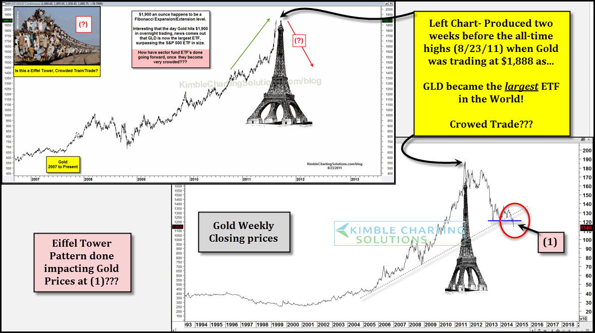
The Power of the Pattern attempts to find key Tops and Bottoms. A few days before the all-time highs in Gold (Around $12 from the all-time highs) the upper left chart was shared, reflecting that an Eiffel Tower pattern in Gold looked to be at hand. At the time, Gold ETF (ARCA:GLD) had become the largest ETF in the world.
The lower right chart is an update on Gold's Eiffel Tower pattern. As you can see, Gold has lost over a third of its value since the original posting, falling around $800 since then. Important price action of late -- Gold at (1), is attempting to break below a one year support shelf.
One of the challenges to the "Right Side" of an Eiffel tower pattern is that assets often fall back to where the entire rally got started. The above mentioned post shares a few key assets that have retraced huge upside moves over the past 20 years.
The Power of the Pattern started sharing a couple of years ago that the $15 level in Silver was the target of a measured move projection, when Silver was trading around $30. Well folks, guess where Silver is trading today?
If you like to buy and hold metals, trade them or think a potential buying opportunity in this hard-hit area is near, I share my thoughts with our members on a weekly basis.
Which stock should you buy in your very next trade?
With valuations skyrocketing in 2024, many investors are uneasy putting more money into stocks. Unsure where to invest next? Get access to our proven portfolios and discover high-potential opportunities.
In 2024 alone, ProPicks AI identified 2 stocks that surged over 150%, 4 additional stocks that leaped over 30%, and 3 more that climbed over 25%. That's an impressive track record.
With portfolios tailored for Dow stocks, S&P stocks, Tech stocks, and Mid Cap stocks, you can explore various wealth-building strategies.
