Stock market today: S&P 500 slips as Trump’s tariff salvo sours sentiment
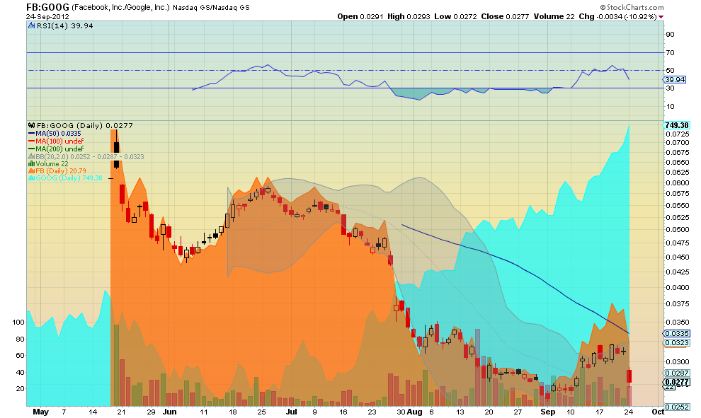
I saw several mentions Monday evening saying something like the money leaving Facebook (FB) stock Monday was flowing directly into Google (GOOG). I am not sure how you could measure that but decided to look at a ratio chart of the two to see what it tells. The Candlesticks are the ratio of Facebook to Google, the orange area the chart of Facebook and the cyan area the Google chart, all since Facebook went public. What does it tell you? For me it shows clearly that the premise is not true. First, the chart for Google has been in a clear uptrend since shortly after the Facebook IPO and before it started falling.
Second, the Ratio chart shows that the movement in Facebook stock is totally overwhelming the impact that Google has on the ratio. The Ratio is identical to the Facebook chart. I have seen this before (look at Lululemon Athletica (LULU) against McDonalds (MCD)), it is not uncommon. Facebook truly is just killing itself.
Disclaimer: The information in this blog post represents my own opinions and does not contain a recommendation for any particular security or investment. I or my affiliates may hold positions or other interests in securities mentioned in the Blog, please see my Disclaimer page for my full disclaimer.
Original post
Which stock should you buy in your very next trade?
AI computing powers are changing the stock market. Investing.com's ProPicks AI includes 6 winning stock portfolios chosen by our advanced AI. In 2024 alone, ProPicks AI identified 2 stocks that surged over 150%, 4 additional stocks that leaped over 30%, and 3 more that climbed over 25%. Which stock will be the next to soar?
Unlock ProPicks AI