Bitcoin price today: slips to $117k from record peak; US inflation awaited
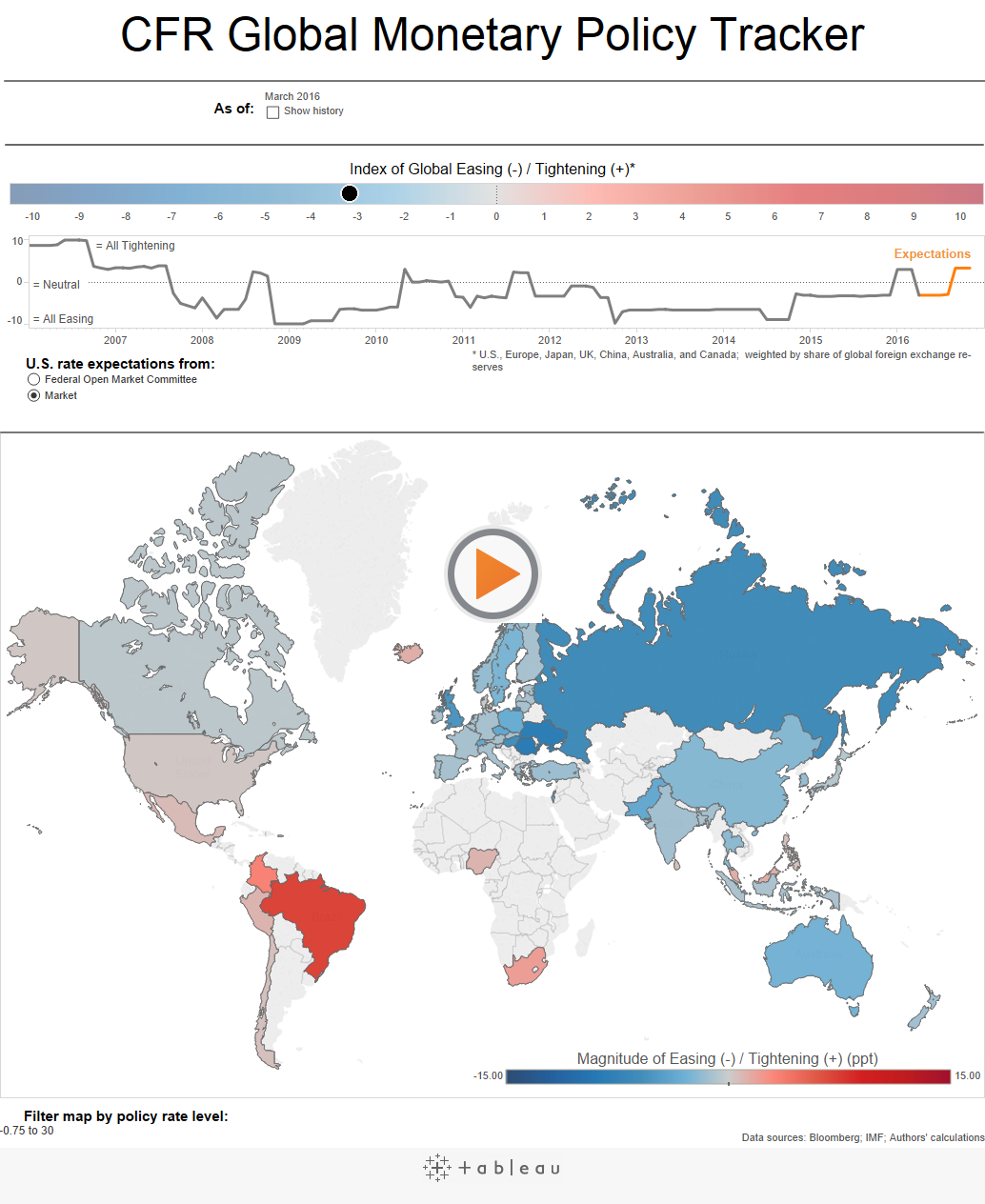
Here’s a Tableau Script I picked up from the Council on Foreign Relations.

The summary “Index of Global Tightening or Easing” color-bar can be found just above the map. The index ranges from -10 (dark blue) to 10 (dark red), where -10 indicates that all countries are easing (as in late 2008) and 10 indicates that all are tightening (as in mid-2006). In generating the Index value at any point in time, each country’s monetary policy stance is weighted by its currency’s share of global foreign exchange reserves. (The United States, therefore, receives a 61 percent weighting.) A country is said to be easing (tightening) policy if has cut (raised) rates in the past three months, or is expected to do so in the next three months. A country is also said to be easing if it is engaged in QE. The line graph below the color-bar shows how the Index has moved over time. On the far right of the graph, future rate-move expectations are used. You can choose whether to see Fed or market expectations.
A feature I would like to see is a history of recent hikes if one hovers over the country, rather than just the current rate. I have passed that idea on.
Which stock should you buy in your very next trade?
AI computing powers are changing the stock market. Investing.com's ProPicks AI includes 6 winning stock portfolios chosen by our advanced AI. In 2024 alone, ProPicks AI identified 2 stocks that surged over 150%, 4 additional stocks that leaped over 30%, and 3 more that climbed over 25%. Which stock will be the next to soar?
Unlock ProPicks AI